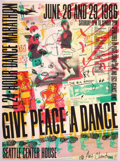
Protests take on a variety of forms, from petitions to sit-ins and sign-wielding on the streets. In 1983, over a million people assembled in New York City’s Central Park for the largest anti-nuclear war protest to date. Beginning the same year, and continuing until 1989, protesters in Seattle showed their opposition to nuclear weapons in a less traditional manner—they hosted a dance-off.
Originally begun as an anti-arms 10k race called “Legs Against Arms,” organizers quickly realized that dancing would be a unusual and fun way of gaining support. The idea was simple: teams gained monetary support for the cause and then assembled in the Seattle Center House where they danced for 24 hours straight. The movement caught national attention, even receiving a national media award, and brought in an estimated 50 to 80 thousand dollars a year in ad revenue alone. Locally, over a thousand people turned out each year in support of the fundraiser.
Art Chantry‘s posters for the event, the most recognized being his poster, Give Peace a Dance, from 1986, captured the idea of dancing as a means of protest. The poster, created from newspaper clippings overlaid with type, doodles, and splashes of color, is a visually overwhelming—yet catchy—graphic. His use of a large, bold sans-serif font makes a clear statement that doesn’t get lost amid the busy image.
Although Give Peace a Dance is an interesting piece owned by institutions such as MoMA and our very own Cooper-Hewitt, it is Chantry’s approach to creating graphics that is the most important quality for new and aspiring designers to consider. In a time when a majority of designs are created using the computer, Chantry advocates a hands-on approach, preferring darkroom clippings and printing presses to computer processors and Photoshop. Largely self-taught, Chantry believes that learning with your hands is what separates a designer from a decorator.
Physical human interaction with a design work provides opportunities for happy accidents, the unintended results of a shaky hand or incorrectly processed film. It seems to me that the precision of the computer takes away the aspects that are inherently human with a simple ctrl-z. Would Give Peace a Dance still have the visual punch if the doodles were perfectly smooth arcs and the lines were created on a Macintosh or if the colors had been chosen through a digitized color palette? It is the ruggedness of human interaction that creates the appeal of this graphic. No doubt, computer generated graphics have an appeal of their own, but what types of playfulness and innovation could be created if we designers stepped away from the computer for a moment and used our hands?
