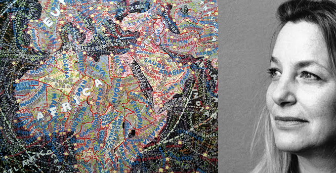
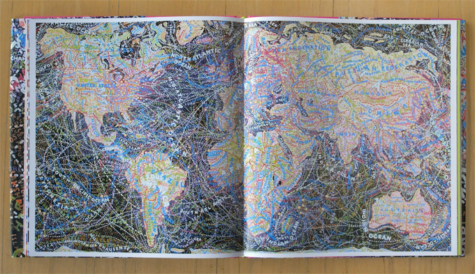
There is a show called MAPS at the Bryce Wolkowitz Gallery exhibiting an abundant selection of cartographic paintings by Paula Scher of Pentagram, including pieces painted between 1998 and 2010. You don’t realize how big these paintings are when you see them online or reproduced as prints—for example, the World Trade map from 2010 is 92” high by 157” wide. The frenetic richness of the depiction communicates the complexity of globalization and information overload of this millennium, with maximum impact. 

World Trade, detail showing part of Africa and Europe. / Paula Scher World Trade, 2010.
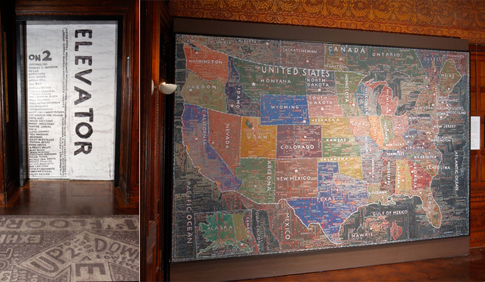
When I was there the gallery was full of people, but in spite of the hubbub and the crush, I was mesmerized by World Trade. It’s much more than a carefully articulated computer graphic rendering of our trading relationships. There is emotional overload in the rich layering and jostling juxtaposition of the brushwork. Paula’s intimacy with typography gives integrity to every character in the words, applied in a frenzy of activity that reflects the endless interdependencies of our globally connected world. You can get a good impression of Paula Scher from the little film in the Hillman Curtis Artist Series. Her professional work is often in our everyday lives. Take, for instance, the Citi logo, with the red arc over the word. She talks about being an intuitive decision taker whose inspirations either come quickly or fail to arrive. She came up with the idea for that logo in the first meeting and sketched it on a napkin, saying, “How can it be that you talk to somebody and it’s done in a second! It is done in a second! It’s done in a second and thirty-four years.” On the laborious work of creating the map paintings on weekends, Scher says, “They’re very important to me because they’re what’s left of craft. . . . The computer made me feel like my hands were cut off . . . and it doesn’t smell right! It doesn’t smell like art supplies, it smells like a car.” In 2003, she created a wayfinding map for Cooper-Hewitt’s National Design Triennial: Inside Design Now exhibition. A rug directed you to the elevator in the Great Hall of the Carnegie Mansion, with a map of the United States mounted on the wall beside it. The rug was festooned with Paula’s rich texture of hand-painted information graphics, full of local and global geographic information. On the outside of the elevator doors she listed the names of the designers in the show, and inside, the floor was covered with a map of Manhattan.

Installation for the National Design Triennial: Inside Design Now, Cooper-Hewitt, National Design Museum, 2003.
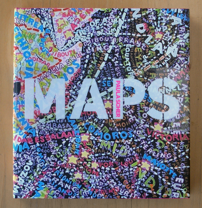
A beautifully designed book acts as a retrospective catalogue for the MAPS show. It is presented in a generous coffee-table format of 12” high by 11” wide, and exquisitely printed by Princeton Architectural Press. You may want the book as a keepsake and memory aid, but if you are in New York before the exhibition closes on February 18th, I recommend a visit to the exhibition as it’s more powerful to experience the paintings themselves.

The MAPS catalogue includes paintings, installations, drawings, and prints.