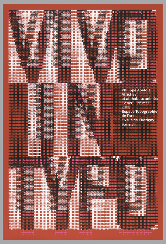
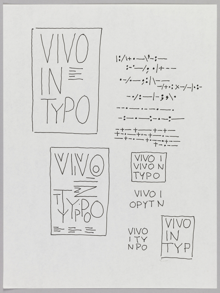
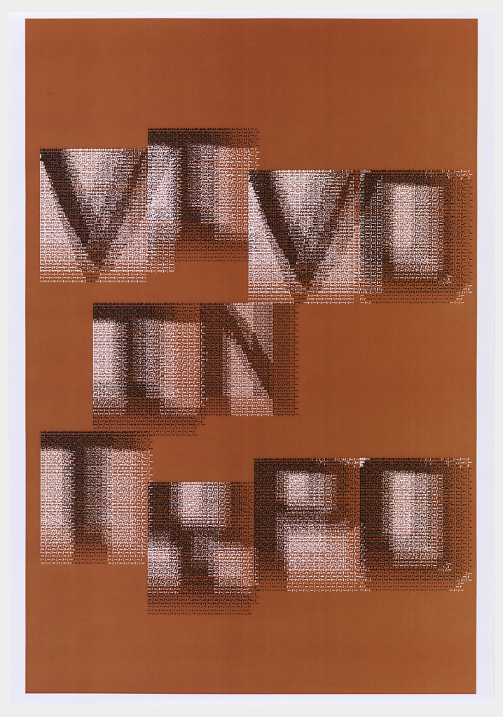
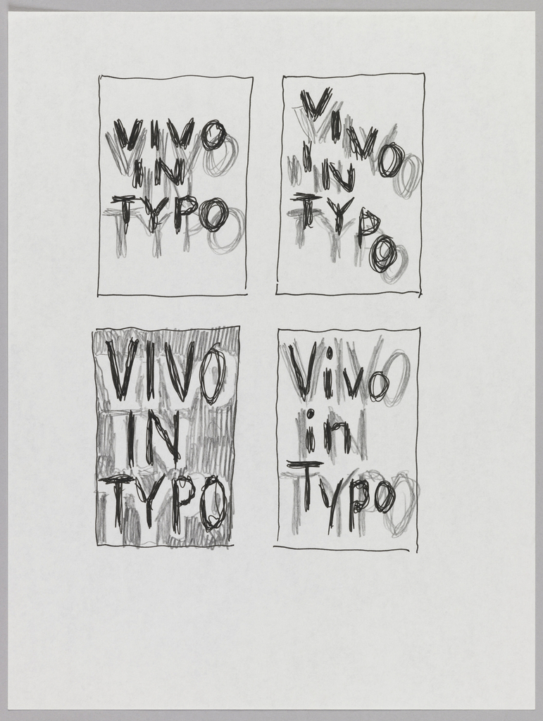
When graphic designer Philippe Apeloig featured his own poster designs at the Espace Topographie de l’art in Paris, he chose the title Vivo in Typo for the exhibition, and decided to make the title the graphic focus of his promotional poster. Apeloig concieved of an image comprised entirely of typography. He began by sketching punctuation marks with ink on paper.
He then moved to the computer, producing pages of digitally-generated punctuation.
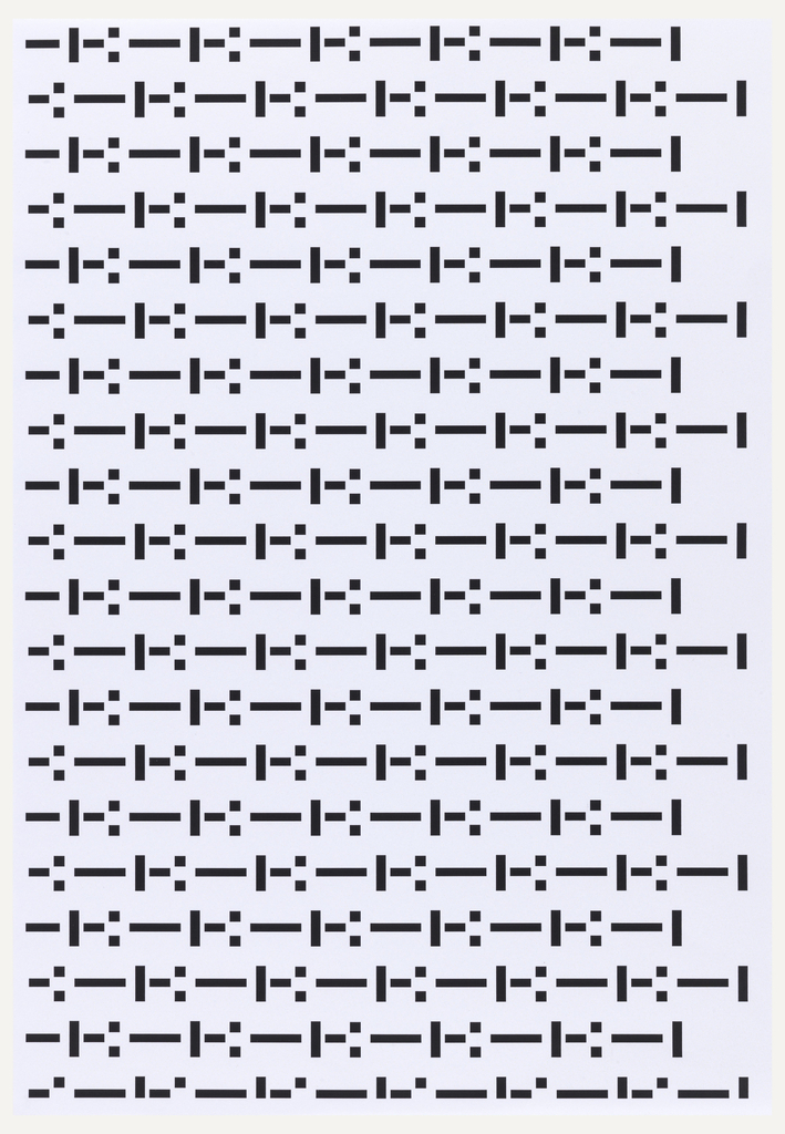
By manipulating the spacing and the weighting of the punctuation, Apeloig was able to create individual text forms.
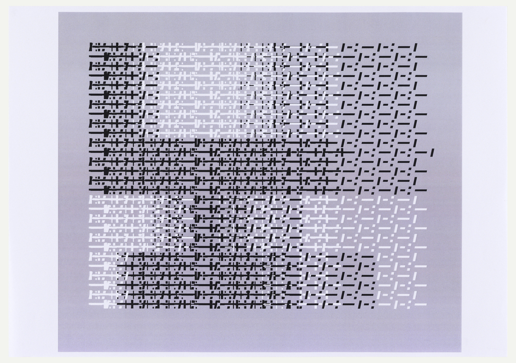
He then layered these text forms in different scales so that the title of the exhibition, Vivo in Typo, emerges as if it were woven together.
Apeloig then returned to sketching to experiment with the layout and development of the text.
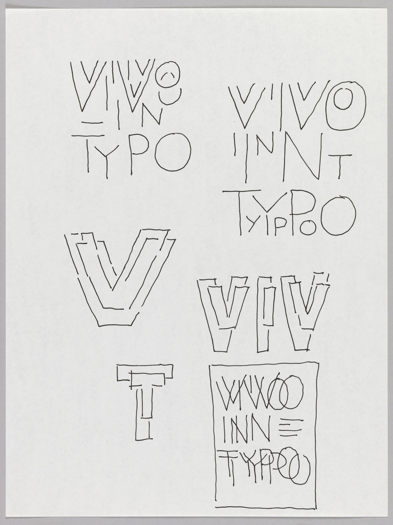
He used both ink and graphite to help him envision the way the text would emerge from the page.
Once he had the final design, Apeloig traveled to the printing firm Serica, based in Nancy, France to supervise its execution. Apeloig chose to execute the final posters in screenprint, a form of relief-printing. The rich appearance of the ink on the paper that screenprint produces creates a sense of vibrancy and tactility that Apeloig views as essential to his design. In the finished poster, the typography works in tandem with the velvety texture and concentrated colors to create a design that seems to emerge from the paper and pulsate in space.

Click here to watch a short video about the making of Vivo in Typo.
Additional sketches and prints related to Vivo in Typo can be seen here.
Apeloig’s poster and some related sketches will be on view in the Making Design exhibition opening December 12, 2014.
Caitlin Condell is the Curatorial Assistant for Drawings, Prints & Graphic Design at Cooper Hewitt, Smithsonian Design Museum.