
The first street signs in New York City, known as “direction boards,” were posted in 1793 and were largely used on horsecars.[1] They were intended to “rationalize the city’s built environment,” and have undergone many changes over the years. The recognizable rectangular shape of today’s signs, like this one in Cooper Hewitt’s collection, date to about 1910, when they replaced the more ornate Victorian signage of the 19th century. Though New Yorkers are likely most familiar with green and white signs (or brown and white for historic landmarked areas, or blue and white for streets with nicknames), New York’s signs have a much more colorful past. From the 1910s to 1930s, a blue and white rounded style was in use, and in the 1970s, each borough’s signs had a designated color combination. Each of these changes aimed to bring greater order and clarity to the city’s streets. In 2010, in an effort to increase safety and legibility, the Federal Highway Administration required that all signs be produced with a mix of uppercase and lowercase letters in a typeface called Clearview, replacing the all-uppercase Highway Gothic typeface that prevailed in New York City for over 50 years.[2] This sign for Brooklyn’s Barclay Street showcases the Clearview typeface:
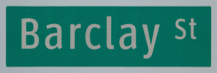
Sign, ClearviewHwy® Typeface: Barclay St, 2011; Printed by 3M ; USA; acrylic pressure sensitive film, 3m flexible UV ink print on 3m diamond grade series 4000 full cube prismatic reflective sheeting, mounted to brushed sheet aluminum substrate; H x W x D: 20.2 x 52.5 x 0.3 cm (7 15/16 x 20 11/16 x 1/8 in.); Gift of Donald Meeker, Meeker & Associates, Inc., and James Montalbano, Terminal Design, Inc.; 2011-24-2
Though the city-savvy pedestrian might overlook these new signs, many small changes make this typeface much easier to read in a greater variety of conditions. The diagram below (also in Cooper Hewitt’s collection) makes clear the marked difference in legibility between typefaces:
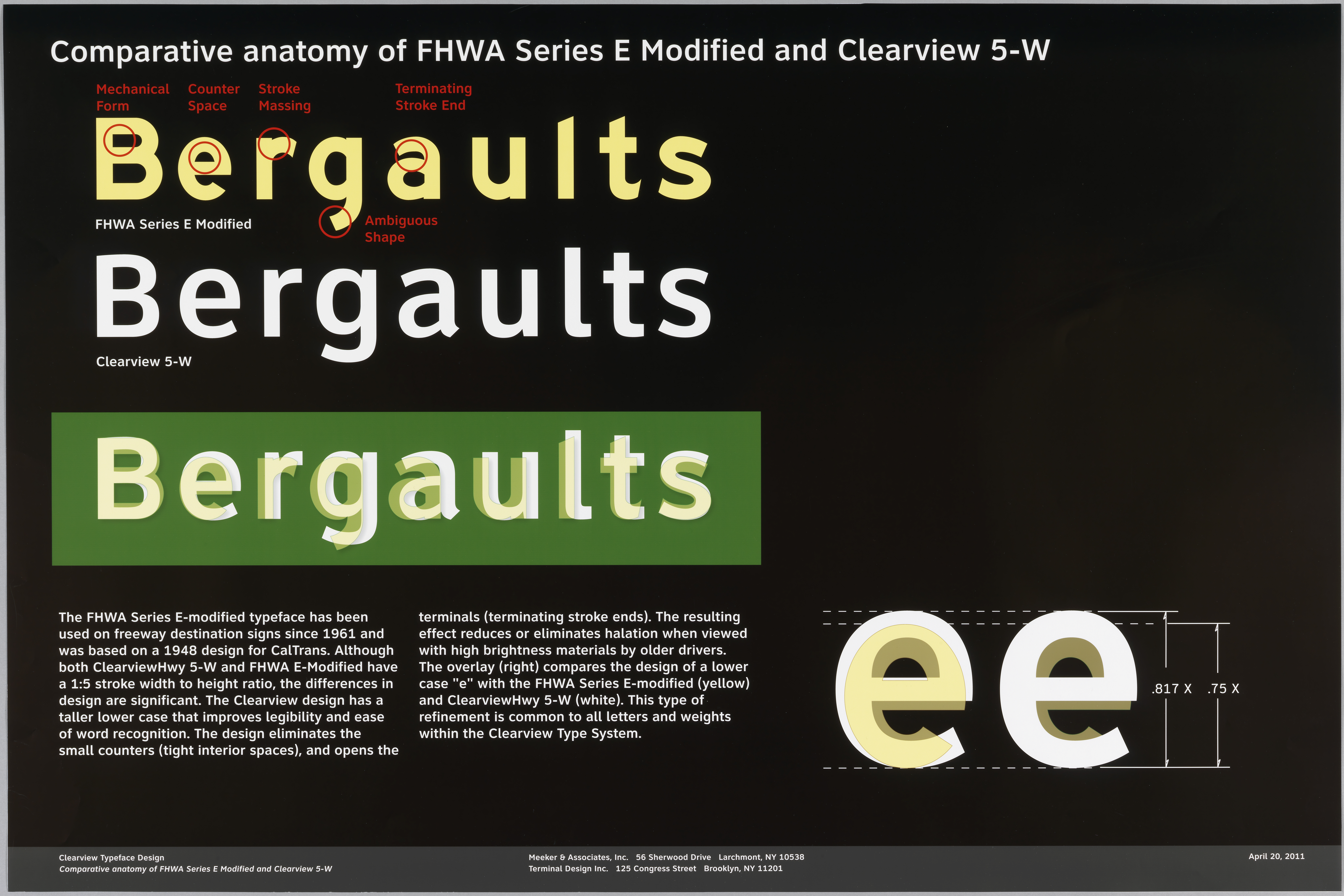
Poster, Comparative Anatomy of FHWA Series E-modified to Clearview 5-W, April 20, 2011; Designed by Donald Meeker (American, b. 1947) and Christopher O’Hara (American, b. 1968) for Meeker & Associates (Larchmont, NY), with graphic design by James Montalbano (American, b. 1953); Color inkjet print with Epson UltraChromeK3 ink on Epson Proofing Paper Commercial; Gift of Donald Meeker, Meeker & Associates, Inc., and James Montalbano, Terminal Design, Inc., 2011-24-1
The material elements of each sign also work to improve visibility in varying conditions. The sheeting and inks, produced by 3M, are designed to deliver “optimal performance at all sight distances” and angles of approach. The ink is designed not only to resist graffiti (including spray paint, permanent marker, stickers, and lipstick!) but also weather erosion for up to 10 years. Though apparently opaque, the ink in fact allows light to pass through it, allowing it to remain equally legible in both ambient daylight and also under direct light at night.[3] The New York City Department of Transportation continues to further the goal of ‘rationaliz[ing] the built environment’ by installing and maintaining over one million street signs, and you can see how they do it here!
Mir Finkelman is the Collections Assistant for Drawings, Prints & Graphic Design at Cooper Hewitt, Smithsonian Design Museum
[1] Burrows, Edwin G., and Mike Wallace. Gotham: A History of New York City to 1898. Oxford University Press, 1998, 363.
[2] Dunlap, David W. “Throughout the City, a New Generation of Street Signs.” The New York Times. August 14, 2012. Accessed August 05, 2019. https://cityroom.blogs.nytimes.com/2012/08/14/throughout-the-city-a-new-generation-of-street-signs/.
[3] The gift of these signs to Cooper Hewitt in 2011 included a compact disc with some brief explanatory materials: Disc, Digital Font: Clearview Font Family, 2004; James Montalbano (American, b. 1953); Digital code in True Type Format, Gift of Donald Meeker, Meeker & Associates Inc., and James Montalbano, Terminal Design, Inc., 2011-24-5.
3 thoughts on “We’re Walkin’ Here!”
Jonathan on August 16, 2019 at 10:34 pm
Thanks for this great little thumbnail history/explication of street sign design!
Sophie Finkelman on August 21, 2019 at 7:02 am
Thanks for bringing a thoughtful study of NYC street signs. You raised my awareness of the
moves taken to make our city a safer place to navigate. Very clear !
Becca Calderon on October 31, 2019 at 6:27 pm
Who knew Graphic Design is such a large part of our everyday civilization. Amazing, delicious details! Thank you for the amazing read!