The design industry in the US flourished in the decade following World War II. In textiles, small designer-led entrepreneurial firms drove the creative awakening, with an emphasis on innovative printed textiles that took their cues from modern art and architecture. Large established textile producers remained on the sidelines, wedded to the traditional brocades and satins favored by more conservative interior designers.
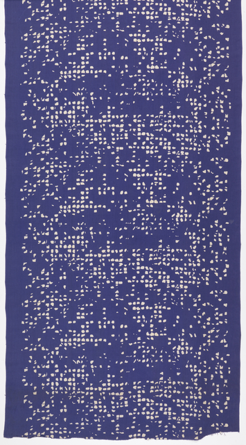
This energetic abstract print, Van Dyke Squares, evidences some of the trends that characterized this vibrant period in American textile design. Producer Arundell Clarke was an English interior designer who came to the US and managed Knoll Textiles’ first showroom in 1947. He then operated his own small design showroom, contracting with independent artists, architects, and designers to create custom fabrics. In 1949, when Van Dyke Squares was introduced, designer Philip Johnson was Director of the Department of Architecture and Design at New York City’s Museum of Modern Art and was in the early years of his career as an architect. In fact, that same year, he completed one of his very first and still most celebrated projects, his home – and ode to Mies van der Rohe – The Glass House in New Canaan, Connecticut.
As far as we know, Van Dyke Squares may have been the only textile design by the iconic Johnson. Like many other textile designs of the post-war decade, Johnson’s abstract pattern was inspired by an eclectic source. A contemporary article in the New York Times reported that the “random composition of small square blotches” was “suggested by a peculiar defect […] on a Van Dyke print of an architectural plan.”[1] Van Dyke printing was a wet-process reprographic technique used in the early 20th century for making intermediary prints and copies of architectural plans with white lines on a dark brown ground. Johnson chose to render the “squares” in his textile design in pure white on a deep blue background, a dramatic color scheme reminiscent of more familiar architectural blueprints.
The impact of this pattern is hard to appreciate from a photo. The repeat is almost 30 inches high, creating a bold large-scale composition that would have been a striking feature in a stark Modernist interior. As Johnson said of his architecture, “effect before everything.”[2]
Maleyne M. Syracuse is a candidate for a Masters Degree in the History of Decorative Arts at the Cooper-Hewitt National Design Museum/Parsons New School for Design and is President of the Board of Directors of Peters Valley Craft Center. She recently retired as a Managing Director in the Investment Bank at JP Morgan and continues to work part-time as an independent professional in corporate finance and investment management.
[1] Mary Roche, “Decorators Hold Luncheon, Exhibit,” New York Times, March 23, 1949.
[2] Philip Johnson, Hilary Lewis and John O’Connor, Philip Johnson: The Architect in His Own Words (NY: Rizzoli, 1994), 39.
