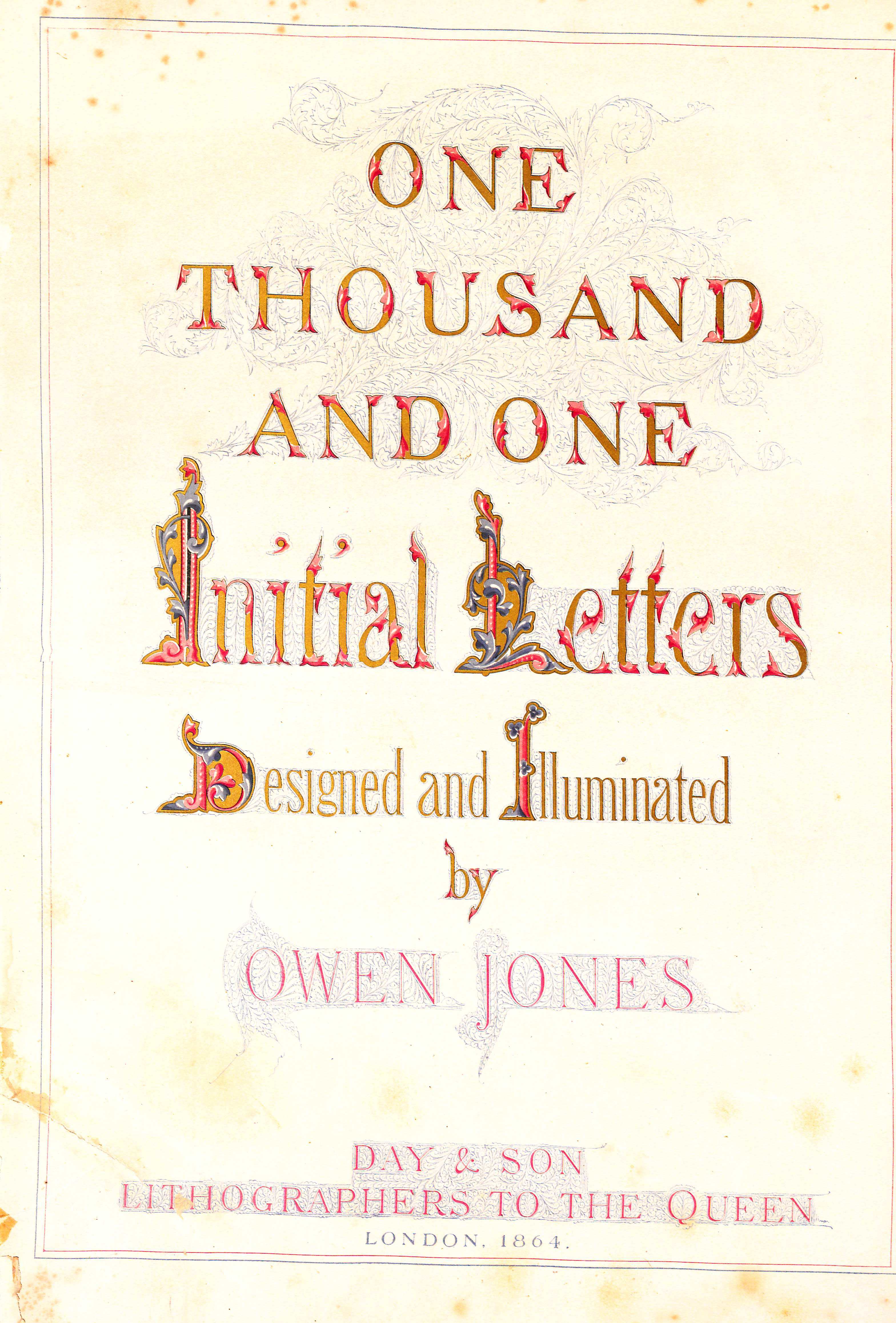
Tausend und ein Anfangsbuchstaben – One Thousand and One Initial Letters – is a rare book designed and illuminated by Owen Jones in 1864, eight years after Jones published his influential design sourcebook The Grammar of Ornament. While the Cooper Hewitt Smithsonian Design Library’s copy is in German, the book was also published in English in the same year. The book, which is dedicated to His Royal Highness the Prince of Wales, consists of 27 plates produced by chromolithography. Chromolithography is a process Jones himself helped pioneer for the publication of his research on the Alhambra, which was not only the most complete books ever produced on the subject, but also marked a milestone in color printing. Chromolithography is a very complex printing technique in which the image is composed of at least three colors, each applied to the print from a separate stone or metal plate on which a design has been drawn. Producing a high quality chromolithograph requires a printer to have a sophisticated understanding of color. This would have been the case for Jones, whose reputation was built upon his revolutionary theories of color, decoration, and ornamentation.
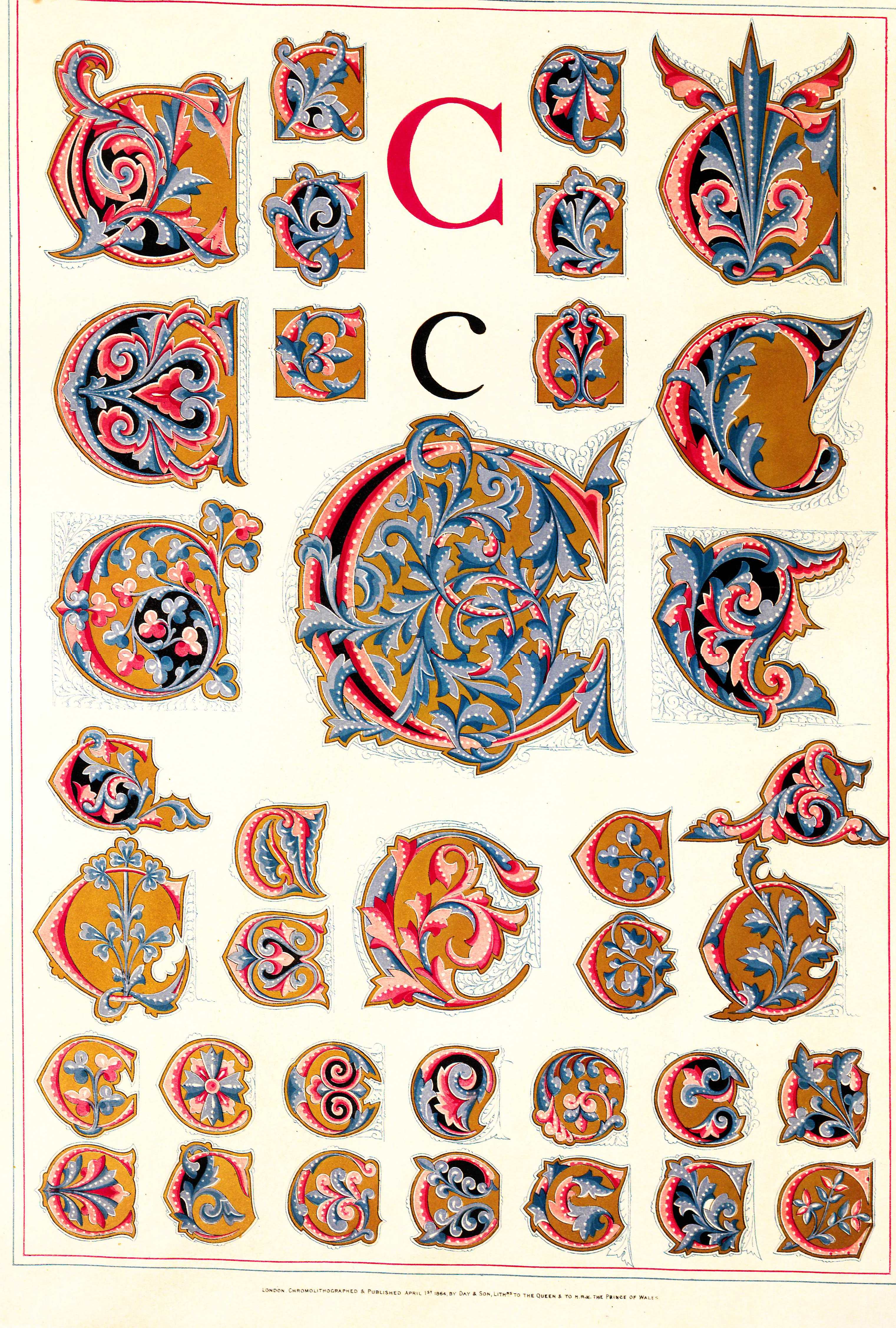
The first 26 plates of the book contain illustrations of the letters of the alphabet, while the last plate contains illustrations of Roman and Arabic numerals. Rendered in shades of red and blue and illuminated in gold, each one of the multiple versions of the characters is a work of art. The letters and numbers are alternatively depicted with deceptively simple lines, or with elaborately drawn acanthus-like scrolls. The designs reveal Jones’ attraction to and appreciation of the design aesthetics of Islamic Spain, in which his theories were grounded, as well as his belief in the use of text in decoration, which is a theme that would be repeated in the Gothic Revival, Arts and Crafts, and Aesthetics movements. The use of chromolithography enabled Jones to produce illustrations with fine lines and precision, and to juxtapose colors to create an almost hypnotic visual depth. The rich illumination, inspired by the sumptuously illuminated medieval manuscripts and religious bindings, would have been particularly attractive to the Victorian middle-class, who had developed a taste for these readable treasures.
Catherine Powell is a graduate student in the History of Design and Curatorial Studies at the Parsons School of Design, and an intern at the Cooper Hewitt Smithsonian Design Library.