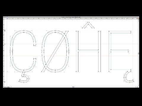
When graphic designer Philippe Apeloig featured his own poster designs at the Espace Topographie de l’art in Paris, he chose the title Vivo in Typo for the exhibition, and decided to make the title the graphic focus of his promotional poster. Apeloig concieved of an image comprised entirely of typography. He began by sketching punctuation marks...
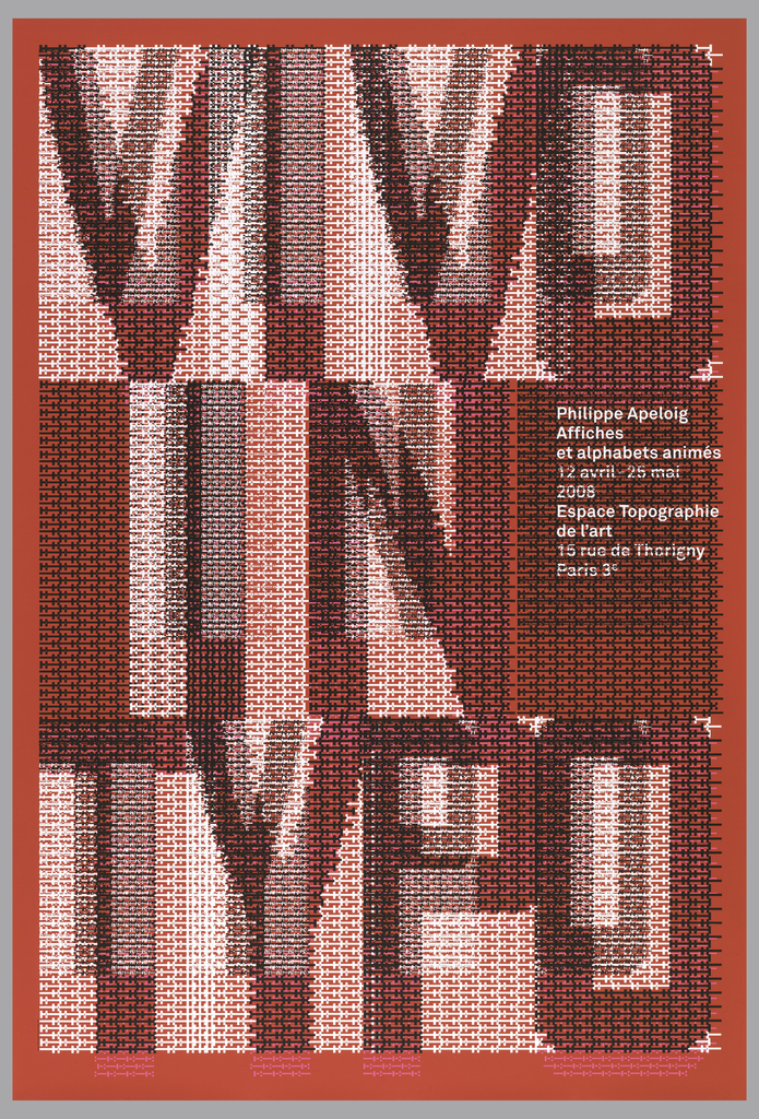
Graphic designer Philippe Apeloig describes the process and thinking behind the VIVO IN TYPO poster. The gigantic poster is part of the Cooper Hewitt permanent collection. You can see it on 12/12 when the museum re-opens, as part of our “Making Design” exhibition. Thanks to Erik Hougen at the Lower East Side Printshop for demonstrating...
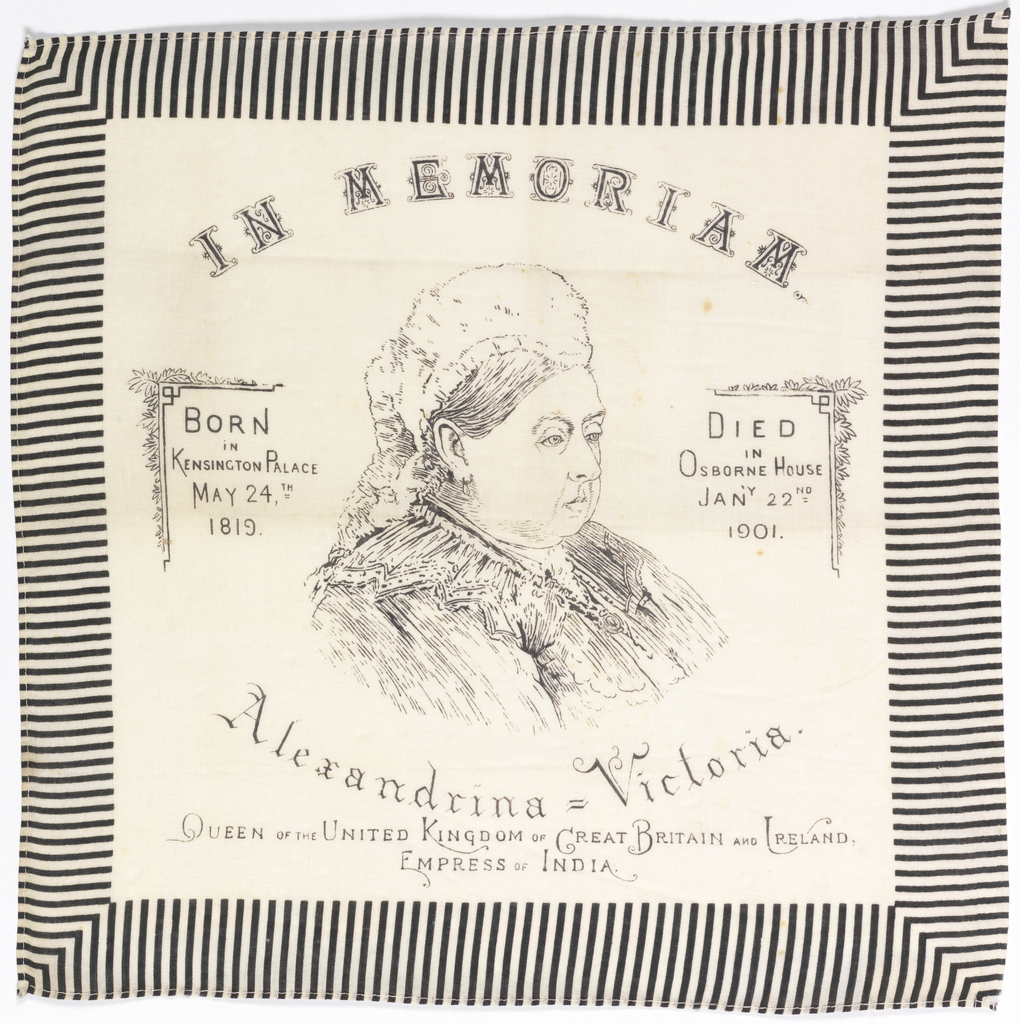
Another sour puss. What is this show? Does it feel more real to pout than to preen? She was devastated when her beloved Albert died. It feels as if she never laughed again. But she had a job to do. It is important to have work. Someone can sell buckets. Someone can be Empress of...
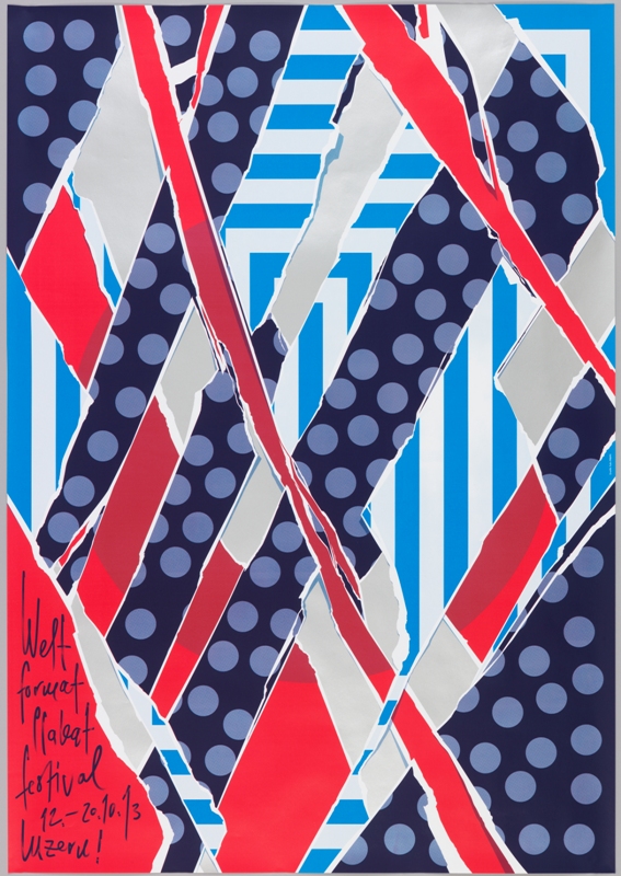
When Swiss graphic designer Felix Pfäffli was asked to design a poster for the 2013 Weltformat Poster Festival held in Lucerne, he grappled with the “strange duplication” of creating a poster to promote a poster exhibition. He turned to the many posters hung on steel poster walls in the streets for his inspiration. As posters...

Inspired by Paula Scher’s work for The Public Theater, the choreographer and dancer Eliot Feld first approached her about designing an identity for his dance company in 1997, when he decided to rename the company Ballet Tech. Scher designed an identity using a typographic family of slab serifs, overlaying the typography on top of photographs...
From a bold new font to a brand new name, hear how Cooper Hewitt is reimagining itself for the 21st century and how the museum’s new identity was conceived and designed. Eddie Opara (Pentagram) and Chester Jenkins (Village) talk with Caroline Baumann, Cooper Hewitt’s director, about the new graphic vision for America’s design museum.
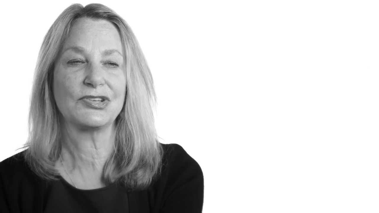
Paula Scher is this year's National Design Award winner for Communication Design. Hear her speak about her first encounter with graphic design, her inspirations, and the unexpected longevity of her images. The National Design Awards were conceived by the Smithsonian's Cooper-Hewitt, National Design Museum to honor lasting achievement in American design. The Awards are bestowed...
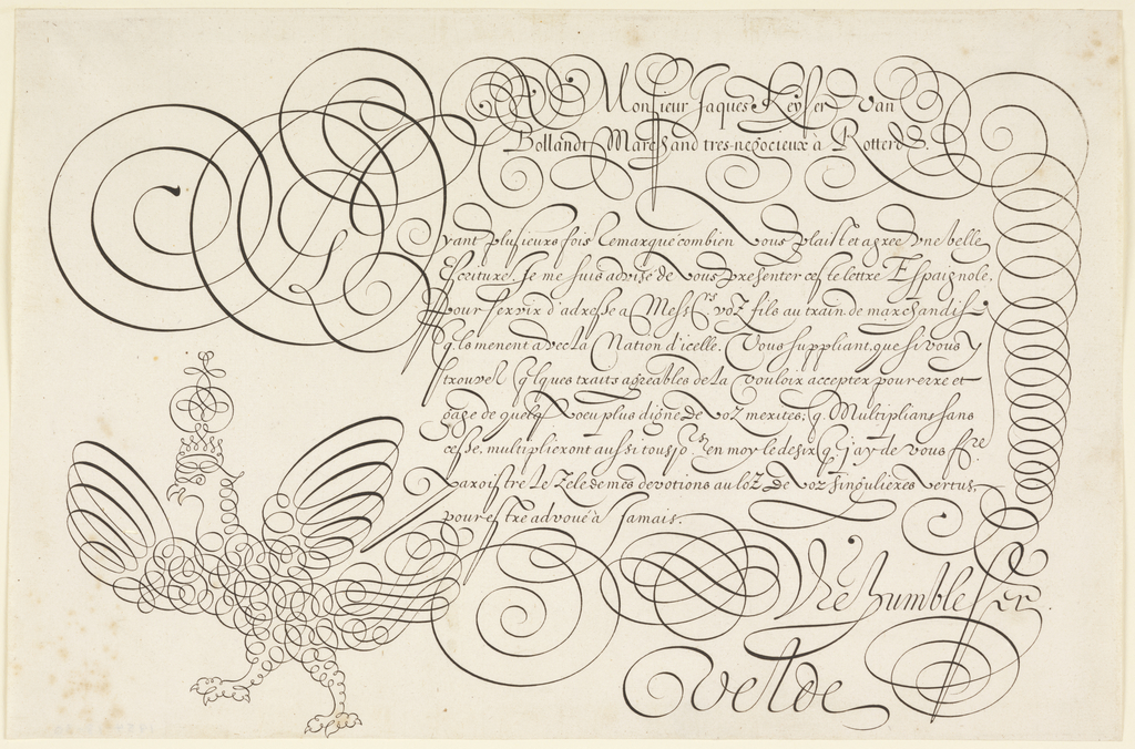
From computers to cellphones, Twitter to Facebook, the typed word dominates our daily life. With the increasing proliferation of digital technologies, access to writing has become almost universal. In the 17th century, however, writing was a skill reserved for an educated subset within the European population. Calligraphy, referred to as the “Tenth Muse,” was considered...
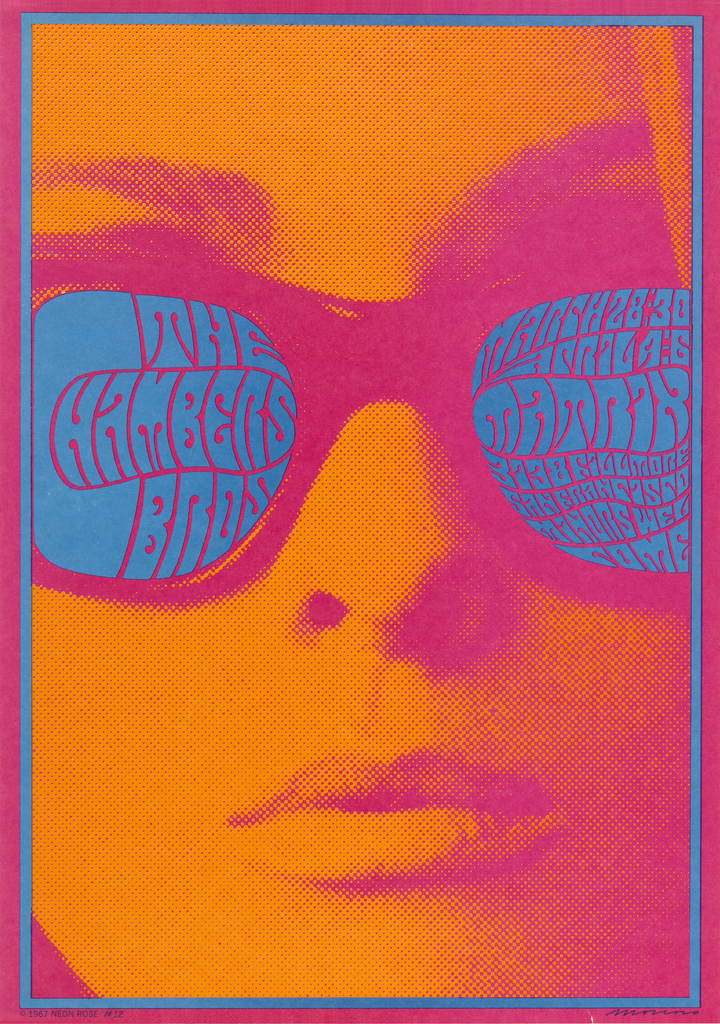
Stare into the electric blue shades of this woman’s sunglasses and what do you see? Even if you know what you are looking for, the blue letterforms come together to form coherent words only with sustained visual focus. If you were to advertise a concert that you wanted people to come to, would you make...