Posters are all around us. We see them on the street, in the subway, tacked to bulletin boards in schools and coffee shops, and hanging on the walls of theaters and concert venues. And we see them online, collected or disseminated on social media. But how are posters made? For the next few days, that’s the...
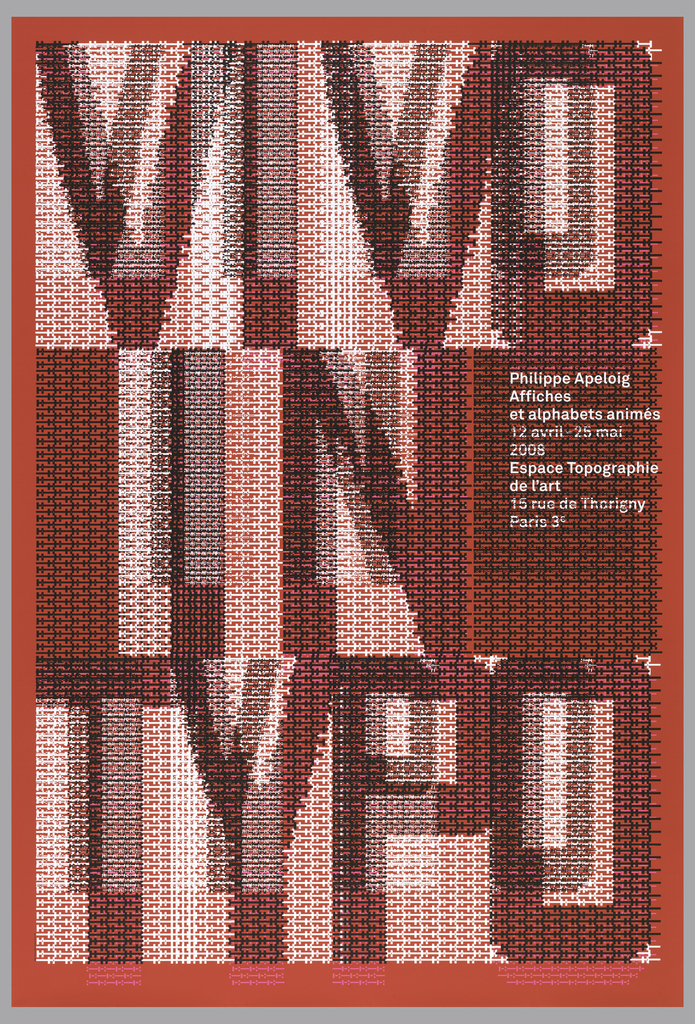
When graphic designer Philippe Apeloig featured his own poster designs at the Espace Topographie de l’art in Paris, he chose the title Vivo in Typo for the exhibition, and decided to make the title the graphic focus of his promotional poster. Apeloig concieved of an image comprised entirely of typography. He began by sketching punctuation marks...