Author: Caitlin Condell

SORT BY:
Fork at top left with end of handle formed by female bust; an extended volute forms length of handle which connects to a satyr whose legs tranform into two fork tines. Spoon at top right has handle formed by satyr-herm whose lower half extends to connect to bowl of spoon with two opposing scrolls and a mask. Design for saltcellar and egg dish in center; figures of Leda and the swan at top of vessel upon a raised rectangular plinth; relief panel with two swans on front side of plinth; lower part of vessel is six-sided with round well for holding an egg on each end and projecting seashell to hold salt in center front; front panel displays figure of Venus reclining on the sea with one elbow resting on a dolphin and other hand holding reigns of two dolphins, ornamental curtain above the scene; dolphin heads on lower corners form the feet; guilloche ornament borders the lower edge; oval reserves with figures on angled sides. Plan of vessel at bottom, inscription located within the rectangle framing for the raised plinth and between the seashell shapes for the salt and round shapes for the eggs.
A Novel Way to Eat Your Eggs
Poached, fried, boiled, or roasted, eggs were an important part of the Italian Renaissance diet. In the sixteenth century, Italian chefs Bartolomeo Scappi and Cristoforo da Messisbugo each published cookbooks that detailed recipes and techniques for preparing banquets, and eggs were often on the menu. One of Scappi’s reoccurring recipes was for uovo da bere, or...
Poster featuring the text "VIVO IN TYPO" composed of red, black and white computer-generated punctuation marks. Additional text with details of exhibition printed in white at the right hand side.
Making a Poster is a Process
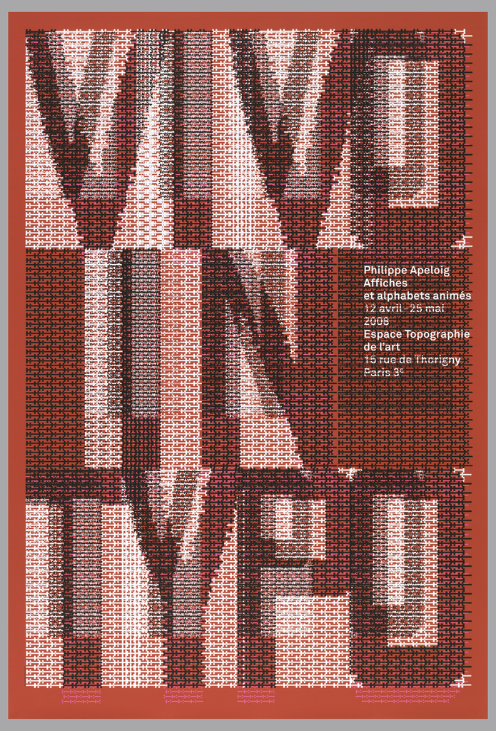
When graphic designer Philippe Apeloig featured his own poster designs at the Espace Topographie de l’art in Paris, he chose the title Vivo in Typo for the exhibition, and decided to make the title the graphic focus of his promotional poster.  Apeloig concieved of an image comprised entirely of typography.  He began by sketching punctuation marks...
A ship-shaped bowl, supported by two mermaids, is surmounted upon a base representing the sea. The bowl is flanked by two high columns with mermaid finials connected to each other by a pole entwined with ribbon. Traces of framing lines are visible at the edges of the sketch.
An Ornate Boat with a Mysterious Purpose
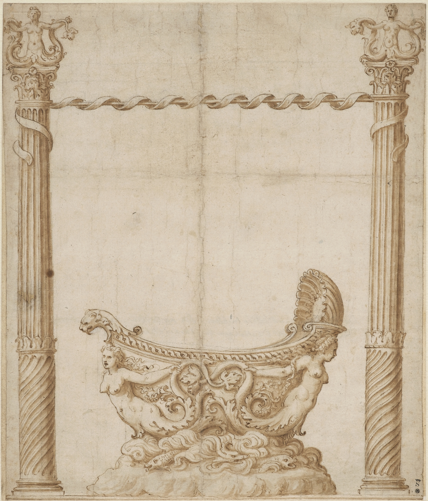
As the artist for the ducal court at Mantua in the early sixteenth century, Giulio Romano designed everything from architecture and stage sets to fresco programs and metalwork. But the purpose of this drawing remains a mystery. It features a vessel in the shape of a ship, supported by two mermaids, who rise up from...
Design for stomacher in diamonds and pearls with alternating rows of blossoms and bows in the center.
A Gem of a Drawing
When the Hewitt sisters founded the Cooper Union Museum in 1897, they sought to provide a rich visual resource for students who were destined to become architects and designers. As they assembled the works of art and design that would enter the museum’s collection, the sisters recognized that drawings offered unique opportunities to learn how...
Weltformat festival poster. Sections resembling torn paper overlap with one another. Each section is printed in one of the following patterns: black with grey dots, blue rectangular stripes, and pink with maroon circle. In the bottom left corner, on a pink section, scrawled text reads: "Welt / format / plakat / festival / 12.-20.10.13 / Luzern!"
All Torn Up
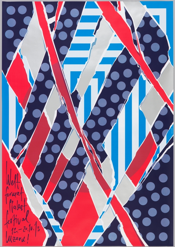
When Swiss graphic designer Felix Pfäffli was asked to design a poster for the 2013 Weltformat Poster Festival held in Lucerne, he grappled with the “strange duplication” of creating a poster to promote a poster exhibition. He turned to the many posters hung on steel poster walls in the streets for his inspiration.  As posters...
Distressed ground resembles a black wall with flaking white paint. The paint flakes are designed like a map, depicting Ginza, Japan. The white dot represents the location of Ginza Graphic Gallery. Title of exhibition appears in black Helvetica text of varying sizes, stacked vertically.
Lovingly Crumpled
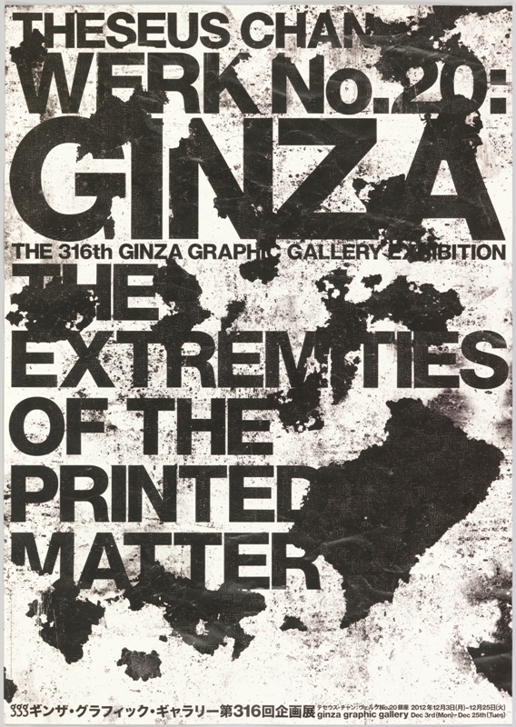
After a decade in mainstream advertising, Singaporean designer Theseus Chan founded the independent consulting firm WORK in 1997. Three years later, he created a sibling publication, Werk magazine. Frustrated by the aesthetic tedium and reserve he perceived at larger ad agencies, Chan used these new ventures to foster innovative design. With WORK, he has devised...
Poster depicts an oculus of digital blocks of color, growing more concentrated as the blocks get smaller and closer to the center. Above: el atomo para la paz; below: GENERAL DYNAMICS; center right: solar dynamics.
Looking Ahead in the Atomic Age
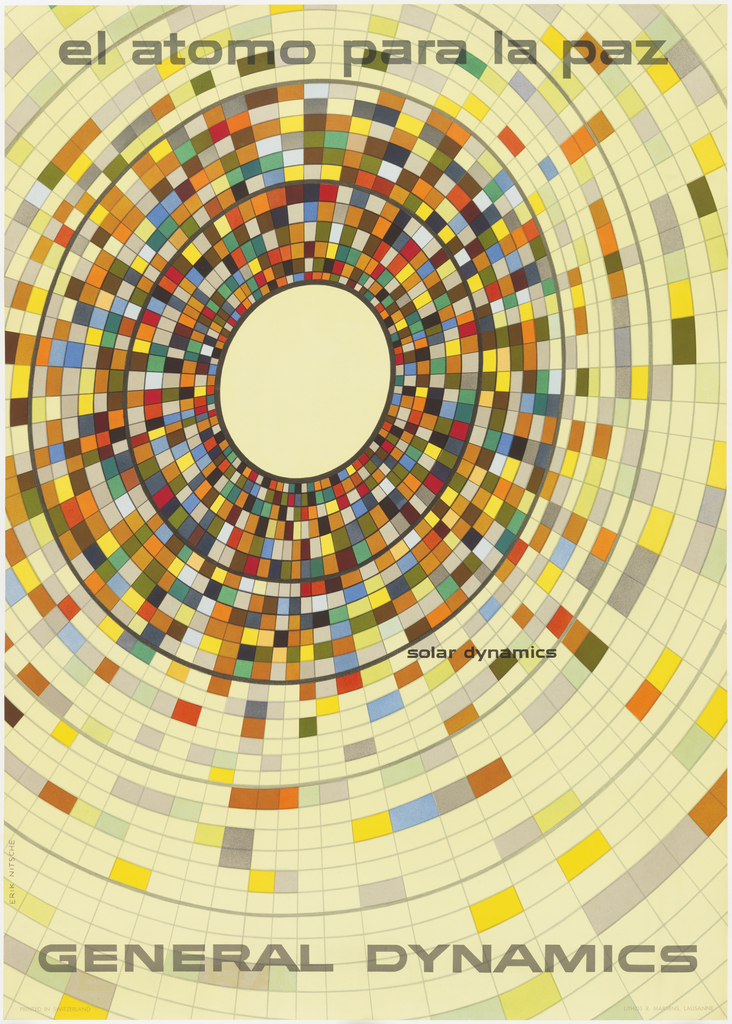
The year is 1955, and Cold War tensions have begun to escalate. General Dynamics is a newly formed parent company overseeing eleven manufacturers, producing cutting edge technology for the defense of the United States. The company is capitalizing on the American policy of nuclear deterrence, but John Jay Hopkins, General Dynamics’ president, wants a graphic...
Poster for The Chap-Book, August 1894. A woman dressed in blue at the center of the image stands in a wood, holding a pair of skates. The words The Chap / Book, printed in red cover the lower left portion of the poster.
Baby, It’s Cold Outside!
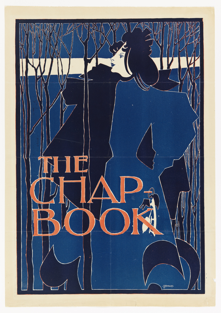
With the temperature outside at record lows this week, I can’t help but think of William Henry Bradley’s The Blue Lady.  Clutching her ice skates in her left hand, she makes a cold winter’s stroll through the thin, bare trees look elegant and placid.  (It is a sad contrast to the bundle of blue layers...
Poster with black and white photo image (bottom) of woman removing freshly-baked biscuits from oven, set against blue printed background. Top section: Background is composed of a red polka dots on white background; title "A Better Home" appears within central band of blue (ovoid shape).
Electrification for a Better Biscuit
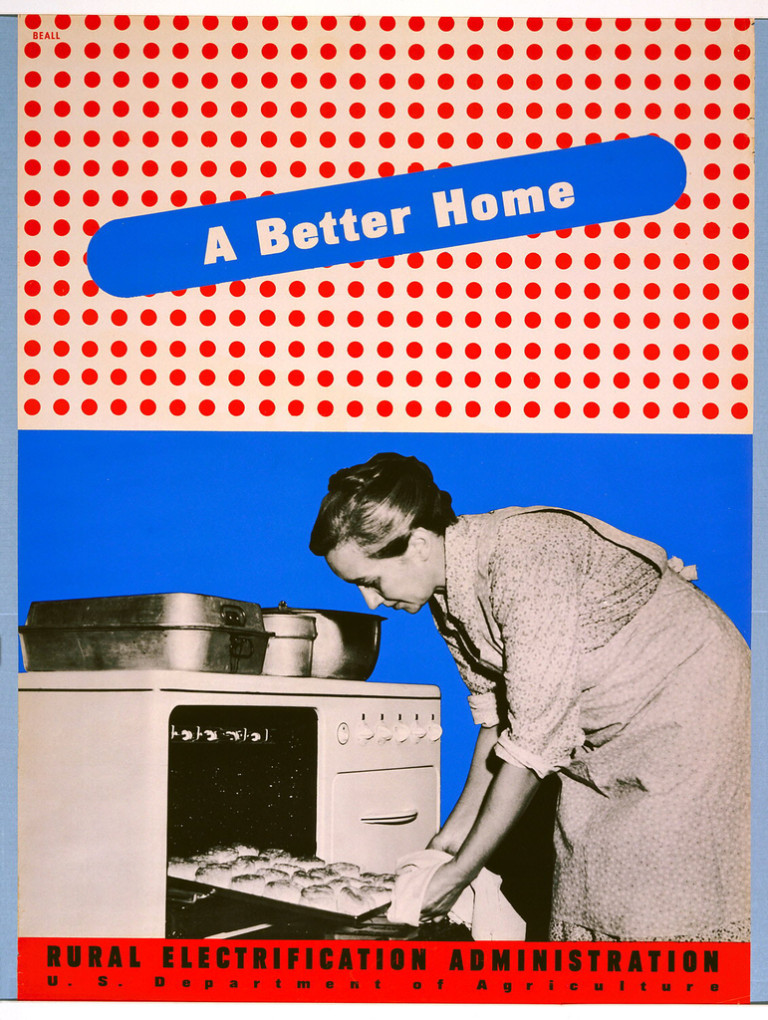
By the 1930s, the vast majority of American urban dwellers had access to electricity in their homes and businesses.  But those in impoverished rural areas were often not serviced by private electric companies, who believed that it was not cost-effective for them to invest in extending power lines into areas of the country that would...