Graphic designer Carin Goldberg (1953–2023) passed away this week, leaving behind a stunning body of work. Cooper Hewitt’s collection includes over two dozen of Goldberg’s book covers, book jackets, and album covers. Created in the 1980s and ‘90s, these portable works of art were designed for viewing in a bookstore or record shop. Goldberg infused each one with its own emotional power—from vigorous splashes of form and color to delicate layers of type and image. Her husband, architect Jim Biber, remembers Goldberg for “her genius, her humor, her taste and her smiling apparition.”
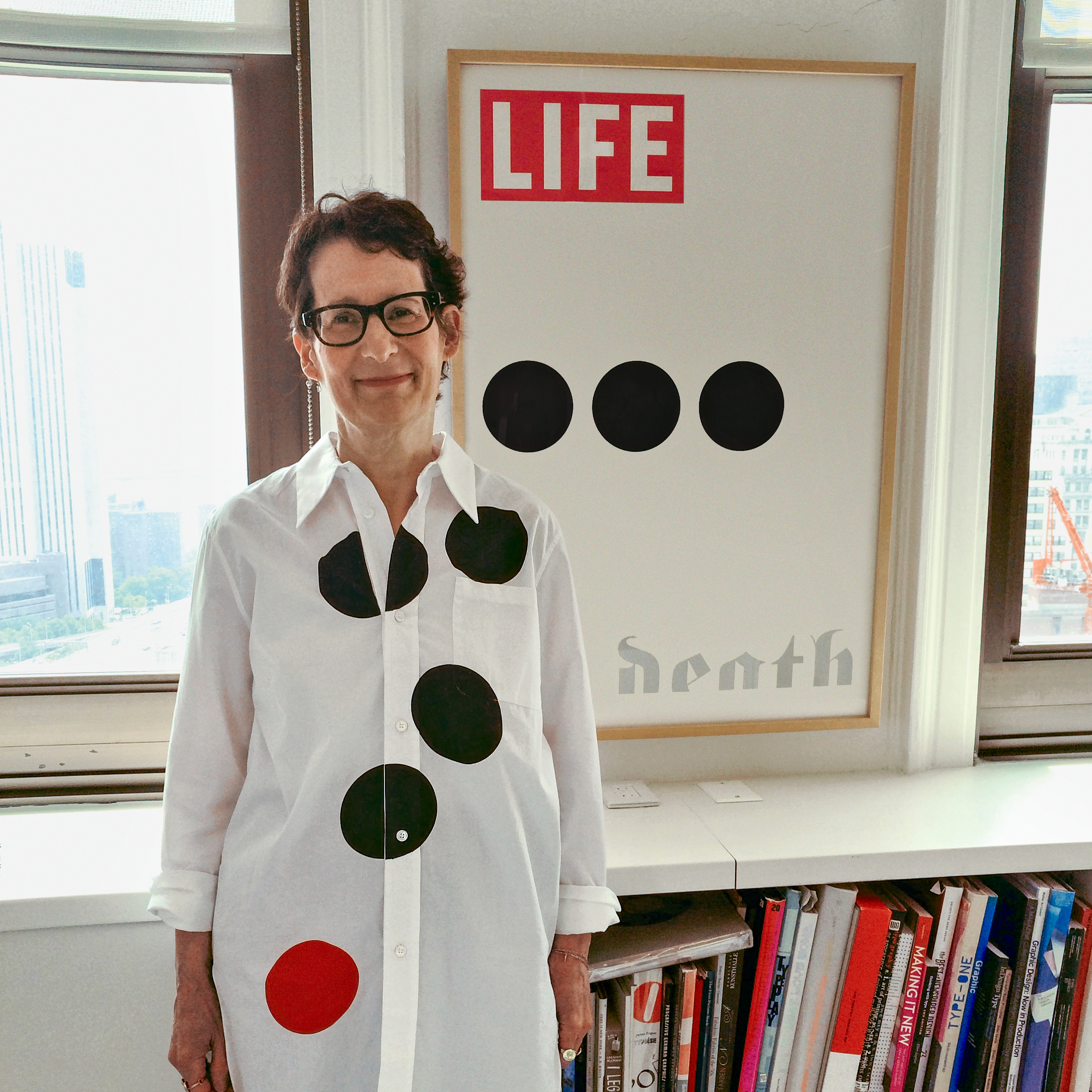
Carin Goldberg standing in front of “Life . . . Death,” her poster tribute to the ellipsis, 2014. Photo by Luise Stauss; blouse by Marni.
After graduating from The Cooper Union in 1975, Goldberg worked with art director Lou Dorfsman at CBS Television, producing ads for TV Guide in an all-male, old-school, cut-and-paste bullpen. This savvy young woman soon became an art director herself, producing ads for CBS Records. Working in the classical music division at CBS, Goldberg combined type and image in an airy, open style that balanced ornament and white space and favored emotional resonance over cold facts. Goldberg left CBS Records in the early ‘80s to start her own business. She worked independently for the music industry and then, around 1984, for book publishers.
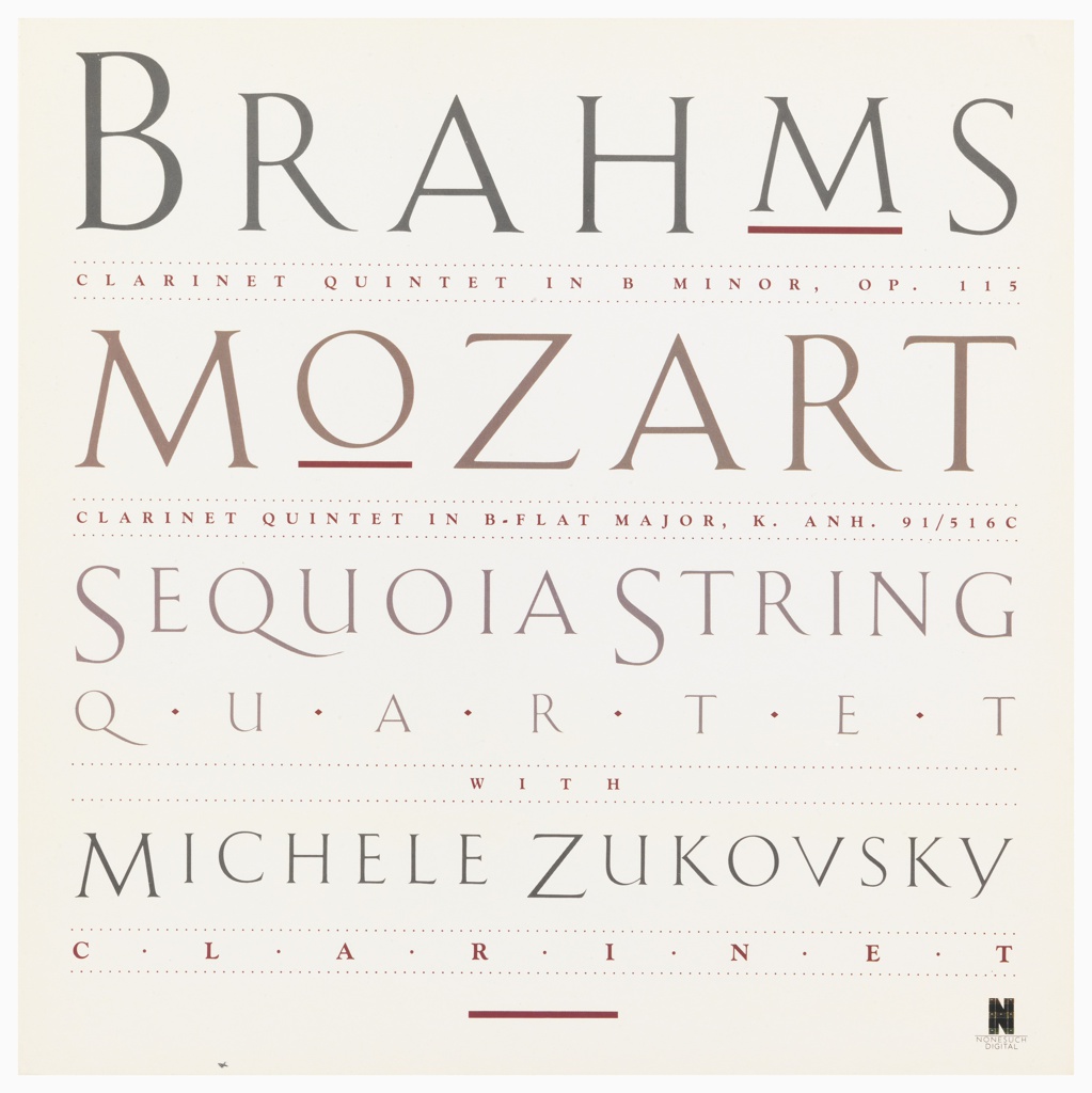
Record Cover, Brahms/Mozart: Sequoia String Quartet, circa 1986; Designed by Carin Goldberg (American, 1953–2023); Offset lithograph on paper; 31.4 × 31.4 cm (12 3/8 × 12 3/8 in.); Gift of Carin Goldberg, 1996-89-11
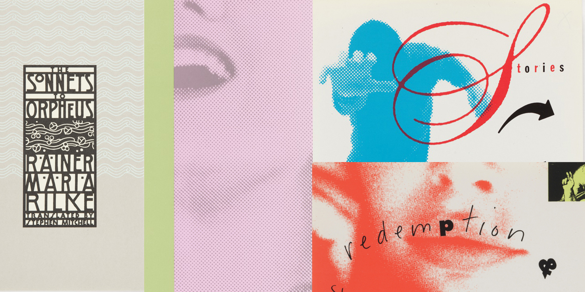
Goldberg brought postmodern sensibilities to the field of book covers. She used decorative typefaces and references to history and pop culture to upend the manly norms of the era: functionalism, truth to materials, and stripped-down geometry. Her 1983 cover for Rainer Maria Rilke’s Sonnets to Orpheus channeled the graphic style of the Vienna Secession. (The densely constructed lettering, locked together within a heavy linear framework, is modeled after Josef Hoffmann’s 1903 identity for the Wiener Werkstätte.) Her 1990 cover for John Holman’s Squabble plays with printer’s ink and halftone dots to embody physical and literary movement. Sensory delight animates the surfaces of such works as The Queen’s Throat and A Quick Kiss of Redemption.
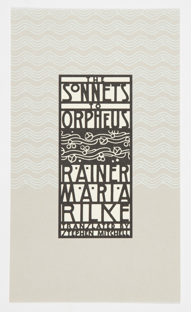
Book Cover, The Sonnets to Orpheus, circa 1983; Designed by Carin Goldberg (American, 1953–2023); Written by Rainer Maria Rilke (Bohemian-Austrian, 1875–1926); Translated by Stephen Mitchell (American, born 1943); Published by Simon & Schuster (New York, New York, USA); Offset lithograph on cream wove paper; 24.6 × 14 cm (9 11/16 × 5 1/2 in.); Gift of Carin Goldberg, 1996-89-1
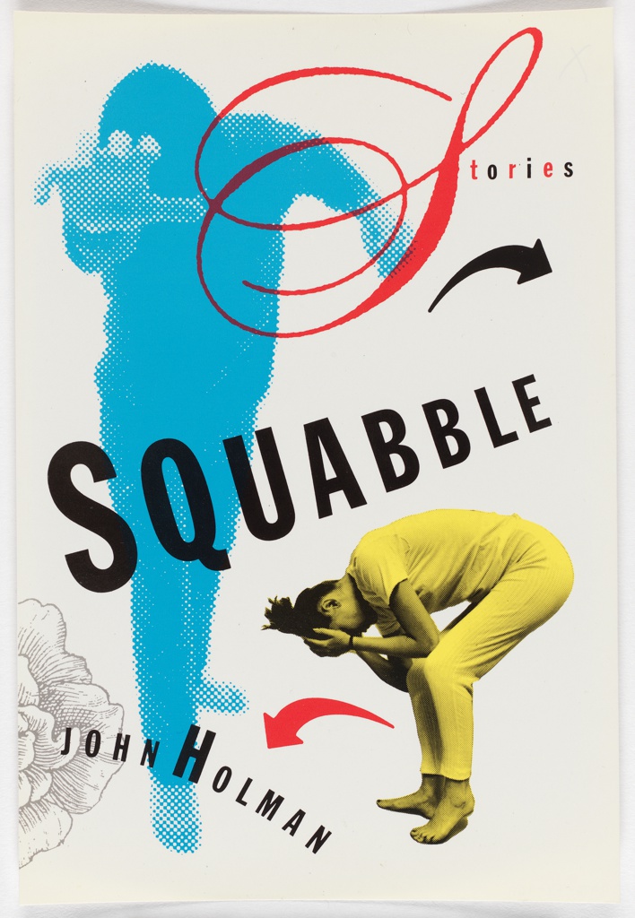
Book Cover, Squabble, 1990; Designed by Carin Goldberg (American, 1953–2023); Written by John Holman (American, born 1951); Published by Ticknor and Fields (Boston, Massachusetts, USA); Lithograph on paper; 21.6 × 14.6 cm (8 1/2 × 5 3/4 in.); Gift of Steven Heller, 1996-74-109
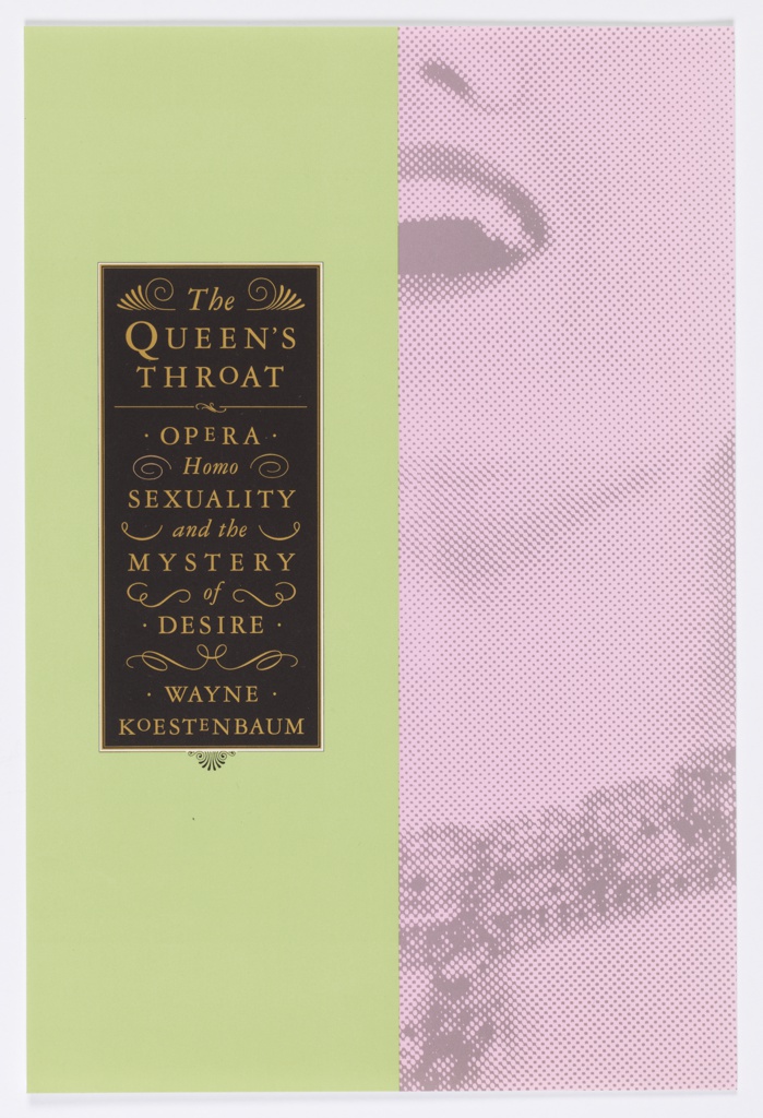
Book Cover, The Queen’s Throat, circa 1993; Designed by Carin Goldberg (American, 1953–2023); Written by Wayne Koestenbaum (American, born 1958); Published by Da Capo Press (Cambridge, Massachusetts, USA); Offset lithograph on paper; 24.3 × 16.3 cm (9 9/16 × 6 7/16 in.); Gift of Carin Goldberg, 1996-89-8
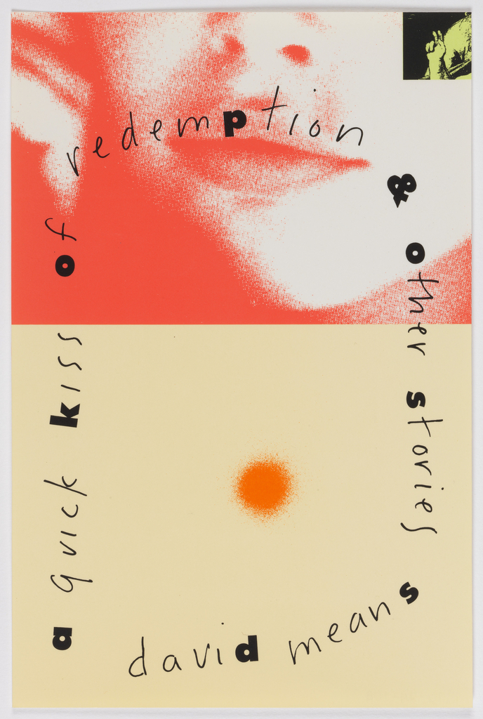
Book Cover, A Quick Kiss of Redemption, 1991; Designed by Carin Goldberg (American, 1953–2023); Written by David Means (American, born 1961); Published by William Morrow and Company (New York, New York, USA); Lithograph on paper; 21.6 × 14.3 cm (8 1/2 × 5 5/8 in.); Gift of Steven Heller, 1996-74-108
Goldberg left the book cover scene in the early 2000s to work on holistic book projects, magazine consulting, and other freelance work. She was a gifted educator, who taught for many years at the School of Visual Arts. Her work was featured in Cooper Hewitt’s 1996 exhibition Mixing Messages: Graphic Design in Contemporary Culture and in the Walker Art Center’s 1989 survey Graphic Design in America.
Ellen Lupton is curator emerita after 30 years at Cooper Hewitt as a curator of contemporary design.