
Graphic designer Tibor Kalman made a circle of blue the visual centerpiece of Talking Heads’ 1983 release Speaking in Tongues. The circle is seven inches in diameter, just like a 45 record. But while the graphic might evoke the standard format of singles from the ‘50s, ‘60s and ‘70s, it was actually inspired by the circular motifs of tantric paintings that had interested lead vocalist David Byrne at that time. Lauren O’Neill-Butler has written that in “the elusive tradition of abstract Tantric painting from Rajasthan, India …works depict deities as geometric, vividly hued shapes.”[1] In addition to Kalman’s design, the influence of these shapes is similarly seen in the cotton screen-print below from Cooper Hewitt’s textiles department.

Many of Kalman’s album cover designs feature altered text and typographical experimentation. This album in particular shows him experimenting with text spacing. When someone speaks in tongues in a religious setting, their speech is not made up of real words and the vocalizations lack comprehensible meaning. Kalman’s decision to toy with the text spacing of the album can similarly be seen as a way to affect the meaning of the words. The comprehensible “Talking Heads Speaking in Tongues” becomes the harder-to-read “TA LKI N GHE ADS SP EAK IN GI N TO NGU ES.” It seems clear that the connotation of speaking in tongues has informed Kalman’s design of the text.
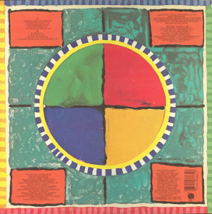
When commenting on the graphic design of Tibor Kalman, David Byrne wrote that Kalman’s work “is the visual equivalent of sampling in music… We read [his design] as visual sentences composed of bits and pieces from near and far, now and then.”[2] The cover of Speaking in Tongues fits this theme of sampling and piecing different things together well. Indeed, the circular tantric motif mentioned above only tells us part of the story. In the book Tibor Kalman: Perverse Optimist, editors Peter Hall and Michael Beirut write that “Speaking in Tongues embodies two different covers… the tantric paintings of Eastern mystic traditions [and] …the strange photographs Byrne had taken of a hotel room chair.”[3] After your eyes stray from the blue circle at the center of the cover, the four hotel chair photographs reveal themselves. Four small squares are again shown on the back of the record in roughly the same position of the squares on the front. The boxes on the back feature song titles, musicians’ names, the barcode and the production credits. Each photograph of the chair features a different colored filter and the concept of four colors is mirrored on the back cover which shows a four-colored circle. The idea of quadrants seems to fit well not only with the obviously square record jacket, but also with the Talking Heads themselves since they had four members.
While combining photos of a chair with tantric motifs might initially seem arbitrary, the fact that Kalman grouped these things together reinforces the notion that his design offers the visual equivalent of sampling. Perhaps the combination of primary colors with simple circles and squares is an ideal way to bring these seemingly arbitrary images together. When commenting on Kalman’s Speaking in Tongues design, Hall and Beirut observed that “somehow, the incongruous themes were neatly sewn together,”[4] but Kalman’s decision to boldly present a circle and a chair side by side causes one to question whether these things are indeed incongruent. The fact that the chair is the only thing shown in each photograph emphasizes the singularity of the object. Suddenly it has something in common with the circle as both are shown in their singularity. None of the four photographs show the chair in a proper sitting position, and this emphasizes the aesthetic aspect of the chair as opposed to the functional aspect. We see the chair not as something someone could sit in but as an object with form, color, and texture, perhaps in the same way we are drawn to the form, color and texture of the circle. While the contents of the cover may indeed be incongruent, Kalman brings these things together in such a way that they don’t immediately seem incongruent—just as a DJ can seamlessly pair a classical recording with a hip hop beat. In this way, David Byrne’s idea that Kalman’s work “is the visual equivalent of sampling in music”[5] is spot on.
Jeremy Witten is a curatorial intern in Cooper Hewitt’s Drawings, Prints and Graphic Design Department. He is currently studying music at the University of Alberta in Canada.
[1] O’Neill-Butler, Lauren. “‘An Egoless Practice’: Tantric Art.” The Paris Review.
[2] Hall, Peter, and Michael Beirut. Tibor Kalman: Perverse Optimist. Princeton: Princeton Architectural Press, 2000.
[3] Ibid.
[4] Ibid.
[5] Ibid.