
This is another odd little wallpaper that intrigued me for a long time. It is just a small fragment showing a wood molding and inset panel with gilt bronze mounts. My first thought is that it was a dado panel and would run horizontally along the bottom of the wall, between the chair rail and baseboard moldings. This made sense given the trend for Mission and Colonial Revival interiors popular at the time. So I was pleasantly surprised when I came across the following illustration in “Wallpaper and Wallcoverings” by A.S. Jennings, 1903, showing this wallpaper in situ. The paper is used as a dado, but a much more elaborate dado than initially anticipated. The paper is shown as part of a wide wainscot with a separate Dutch-inspired wallpaper installed above. This type of wall treatment, with its very masculine nature, would be appropriate for an entry, hallway or library, though it would also work in a dining room.
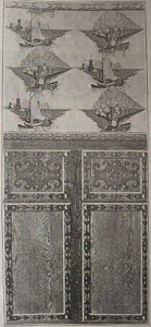
Three different wallpapers were used to create this wall treatment: the small inset panel being featured was used along with a similar printed wood grain with architectural moldings along either edge to form the wainscot, with a separate wallpaper containing Dutch views above. The partial molding on the featured paper would serve as the top and bottom molding on the lower inset panel, while the side moldings on the lower panel could be cut out and serve as the moldings framing the Dutch scenes. The benefit of printing the second wood grain paper with parallel moldings, rather than completed inset panels, is that it provides some installation flexibility, allowing the homeowner to adjust the height of the wainscoting for best effect.
The Birge wallpaper company was one of the older and larger wallpaper companies in the United States, operating from the 1830s into the 1950s. Their variety of products covered the market, from hand-glazed imitation leather wallpapers to the more mainstream repeating patterns.
One thought on “Wainscot and Windmills”
Bo Sullivan on January 25, 2016 at 1:13 pm
I love it when you feature Birge papers Greg, thanks. And there is more to this story…
Look closely at the Jennings wall view (which was drawn from the 1903 Birge Book, published in late 1902 for the 1903 season) and you’ll notice that the wood grain in the two panels does not match – i.e., there is no repeating pattern. This is because Birge produced the wood grain paper by inking and taking direct impressions from 24-foot long planks of real wood to create the background.
They called these “paper veneers” and promoted them as a less costly substitute for luxurious paneling in walnut, oak or bird’s eye maple. In the case of the pattern above and others like it, the design was hand-block printed over the paper veneer to create the illusion of depth. These paper veneers remained popular for a number of years.
Read more about Birge paper veneers here: http://arcalus.com/about/m-h-birge-wallpapers/the-birge-veneers/
Coincidently, the 1903 Birge Book also featured the introduction of the Shepherdess pattern reproduced from the Livingston Manor, which you featured back in 2014: http://www.cooperhewitt.org/2014/05/07/landscape-views/
Martin Howland Birge operated as a high-end wallpaper dealer in Buffalo from 1834, and Birge began printing their own papers in 1878 after his two sons joined the enterprise. Birge remained family owned (besides a brief stint in the National Wallpaper Company trust between 1895 and 1900) until 1959, when the company was sold to Canadian Wallpaper Manufacturers, Ltd. Birge remained in business until being closed in 1982, at the time the country’s oldest wallpaper manufacturer.