The year is 1955, and Cold War tensions have begun to escalate. General Dynamics is a newly formed parent company overseeing eleven manufacturers, producing cutting edge technology for the defense of the United States. The company is capitalizing on the American policy of nuclear deterrence, but John Jay Hopkins, General Dynamics’ president, wants a graphic identity for the company that casts it as an arbiter of peace and prosperity, not war and destruction. How’s that for a design challenge?
Enter Erik Nitsche (1908-1998), a Swiss-born graphic designer who studied at the Collège Classique in Switzerland and the Kunstgewerbeschule in Munich before immigrating to the United States in 1934. Nitsche was already known for the covers he created for avant-garde and multilingual cultural publications in Europe. In the United States, he had designed illustrations and covers for major American magazines such as Life, Town and Country, Harper’s Bazaar and Vanity Fair, and he had developed advertising and promotional campaigns for the cinema giant Twentieth Century Fox and the New York Transit Authority. He had also designed many album covers for Decca Records.
Nitsche became a full-time consultant to General Dynamics in 1955. His first project was to design the company’s exhibition for the International Conference on the Peaceful Uses of Atomic Energy, held in Geneva, Switzerland. Co-exhibitors included other major American corporations including General Electric and Westinghouse. Hopkins wanted Nitsche’s installation to lift General Dynamics’ reputation to those of their fellow exhibitors. As the manufacturers of the first atomic submarine, the Nautilus, and with a commission to build the first atomic airplane, General Dynamics was far ahead of many of these competitors when it came to business. But since such projects were top-secret, the company had almost no material that they could share with the general public. Nitsche was forced to find a way to express the company’s mission with only the vaguest suggestion of actual products.
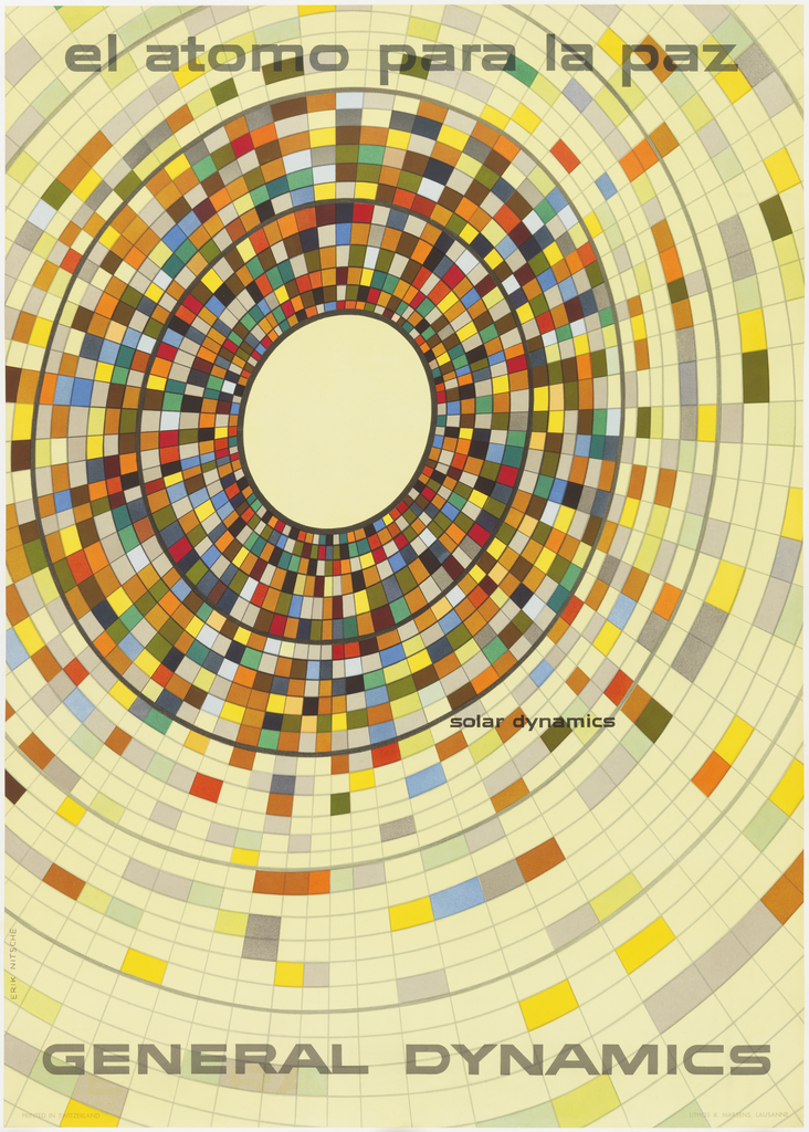
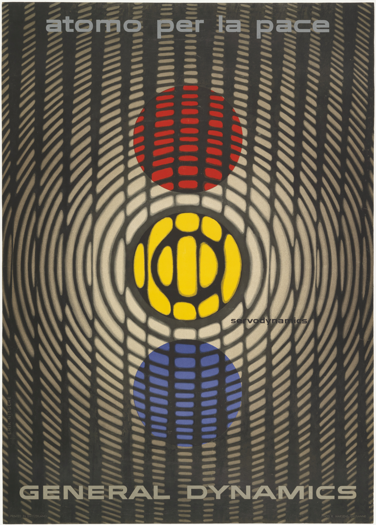
Nitsche’s groundbreaking solution was a Symbolist graphic presentation of peaceful uses of the atom, “Atoms for Peace.” Steeped in the tradition of Swiss graphic design, Nitsche suspected that his European audience would be drawn to the medium of posters. He created six designs that were printed in six languages, representing different fields of General Dynamics’ scientific and technological research. Combining influences from modernist fine art and scientific imagery, Nitsche created posters that boldly suggested the exciting, and peaceful, possibilities of the future.
The initial poster designs were so successful that the designer produced several more sets in the series. Nitsche went on to develop General Dynamics’ identity campaign and corporate advertising for the next nine years.
The designs for the “Atoms for Peace” campaign have become icons of 1950s graphic design. Their visual language is now synonymous with the atomic age vision for an idealistic future, and a remarkable solution to a tough design challenge.