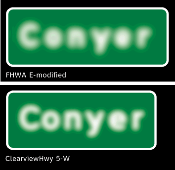
Cooper-Hewitt, National Design Museum has just acquired its first digital font, the Clearview family of typefaces. Featured in Cooper-Hewitt’s 2010 National Design Triennial: Why Design Now? exhibition, Clearview is a beautiful example of design as a form of social activism. As baby boomers reach their mid- to late sixties, highway sign legibility has become an important issue. The Clearview project seeks to improve the readability of signage for drivers, especially those over the age of sixty-five, who constitute roughly one-sixth of the driving public. Since the 1940s, the U.S. Federal Highway Administration has used a standard typeface colloquially known as Highway Gothic (FHWA E-modified). One of the main issues with this font is that at night, letters can appear to have a halo around them due to the reflective surface on which the signs are printed.
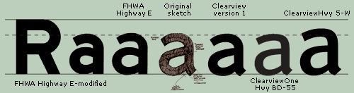
The design team of Donald Meeker and Chris O’Hara from Meeker Associates and type designer James Montalbano of Terminal Design, working with researchers from the Pennsylvania Transportation Institute and the Texas Transportation Institute, showed that Highway Gothic did not meet the needs of older drivers, many of whom have reduced contrast sensitivity (especially with highly reflective road-sign materials) and slower reactions to changing road conditions. To meet this challenge, Meeker and Montalbano created a new font comprised of graceful, elegant letterforms that increase visibility at night and from a distance.
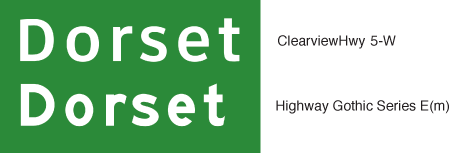
The designers achieved their goal by adopting several strategies, such as using mixed-case letters as opposed to the original all-capital-letter Highway Gothic font; opening up the interstices of problematic lowercase letters (a, e, s); and increasing the height of lowercase letters with respect to capital letters. Most important, they achieved greater clarity without enlarging the size of signs and adding visual clutter to the roadways.
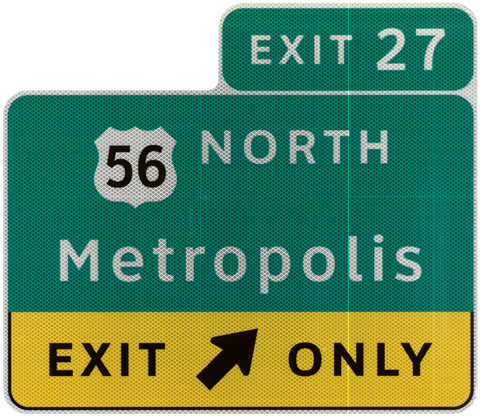
Clearview received provisional approval for use on positive-contrast road signs (light against a dark background) from the FHA in 2004, giving states the choice of adopting the font for their expressway signage. It is presently used in more than twenty states and has also been adapted for road signs in Cyrillic and Greek. Clearview’s designers still have kinks to work out, including issues with letter spacing and approvals for dark- and light-contrast signage. But the fact that designers are recognizing that an increasing segment of the population has problems with reading signage is a significant first step in a broader design challenge.