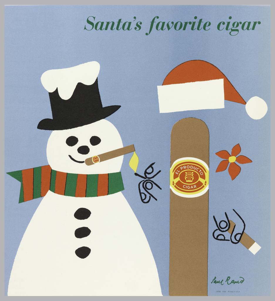
The characteristic wit and whimsy of graphic designer Paul Rand dominates a long-running series of ads designed for El Producto in the 1950s. Already wildly successful by the 1940s, Rand was hired in 1952 to revamp the American-made cigar company’s advertising efforts after production shifted from hand-rolled to machine-rolled cigars. To enliven these factory-made products,...
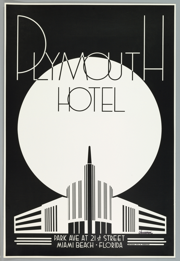
In 1977 Miami’s South Beach lay in ruins: unkempt and forgotten by time. In less than 50 years, the district had gone from a lively and glamorous area to one that was run down and boarded up. With preservation in mind, a Miami Beach resident and mechanic by the name of Woody Vondracek set out...

Brooklyn-based graphic design studio Other Means discusses designing the book that accompanies the exhibition and their approach to "American" design.
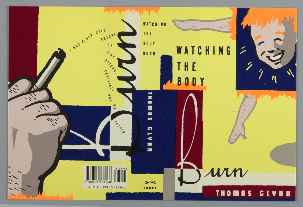
If you’re judging this book by its cover, Chip Kidd’s 1989 design for Watching the Body Burn by Thomas Glynn might encourage you to wonder what crazy contents lie within. The disjointed imagery, text, and loud colors certainly draw consumer attention, but Kidd’s design is more than a sales tactic—the frenetic cover design complements the...
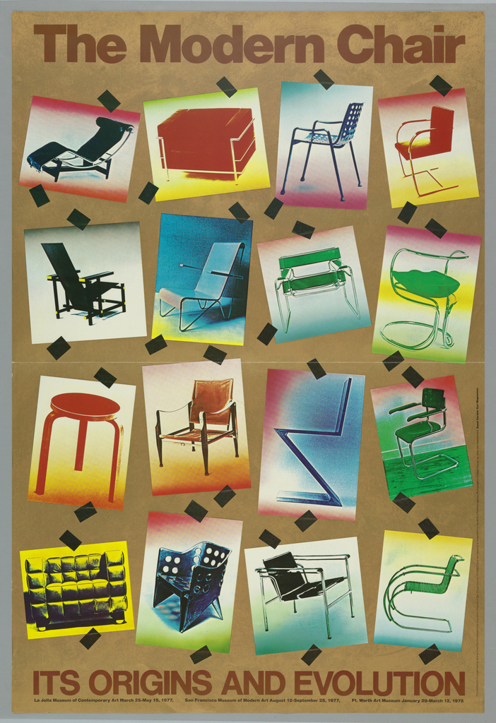
This poster for the La Jolla Museum of Contemporary Art’s exhibition The Modern Chair: Its Origins and Evolution was designed by John van Hamersveld in 1977. Van Hamersveld, a California born and bred graphic designer, is most widely known as the artist behind the iconic 1964 Endless Summer movie poster. Incorporating fluorescent paints and striking graphic language, van Hamersveld brought...
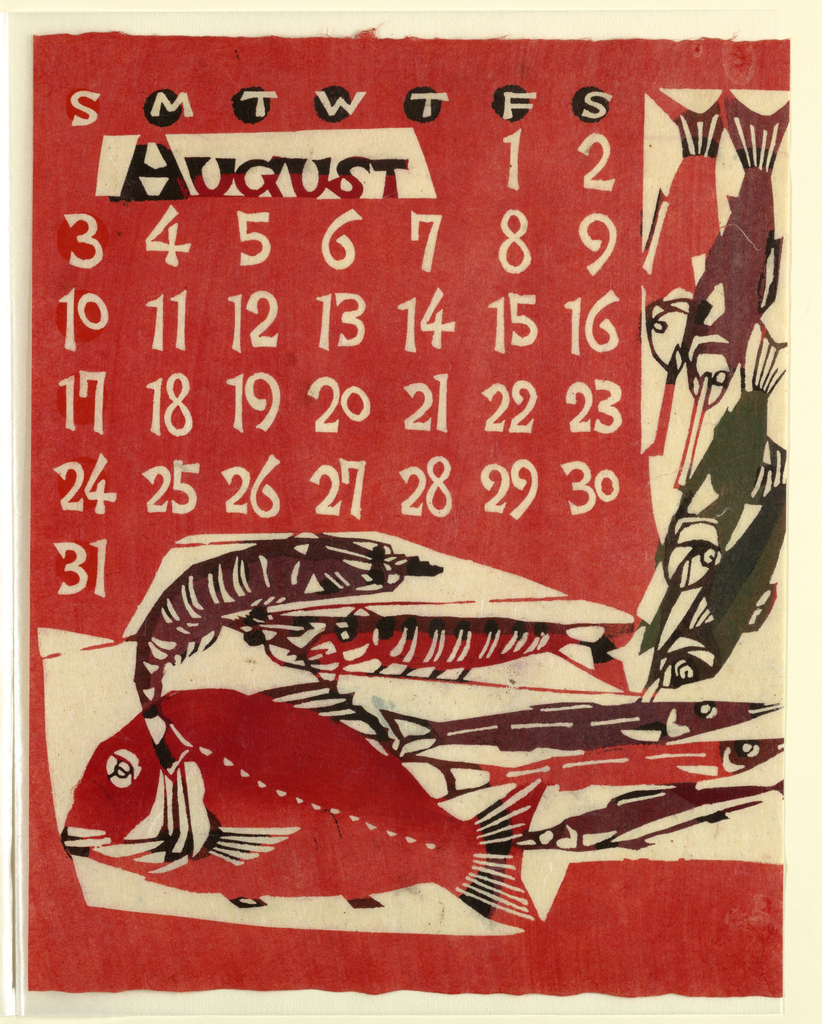
The brightly saturated colors of this August calendar page seem like a perfect salute to summer. To create the designs for this 1969 calendar, Takeshi Nishijima applied a paper-dyeing technique based on the traditional resist-dyeing process of katazome. Katazome relies on the use of katagami (stencils) to create hand-patterned textiles, most of which were used...
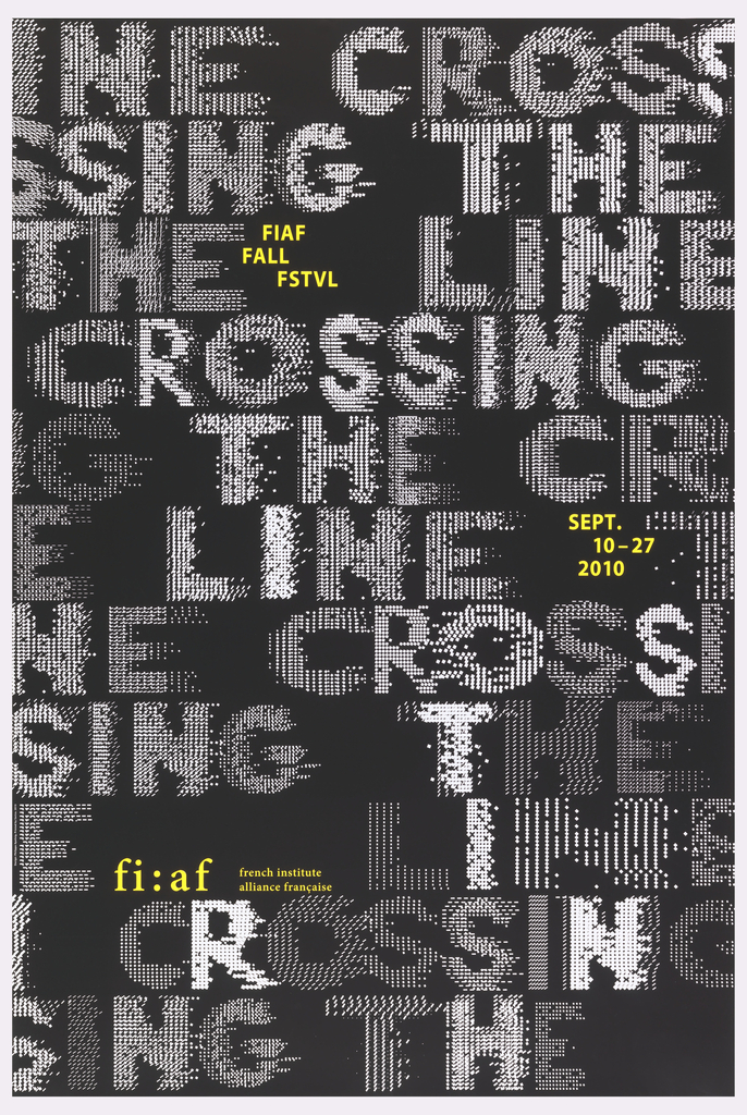
This 2010 poster, designed by the French graphic designer Philippe Apeloig, advertises the annual interdisciplinary fall festival of the French Institute Alliance Française (FIAF) in New York City. Apeloig’s design employs the same fundamental typographic approach that he used in his 2006 poster, Vivo in Typo, whereby he manipulates the spacing of computer-generated punctuation to...
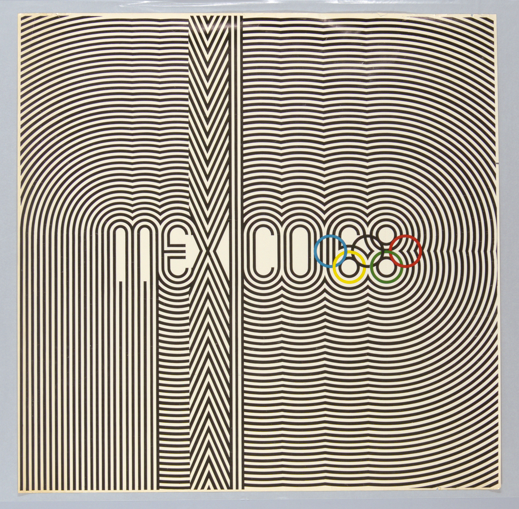
While the world’s best athletes are the obvious stars of the modern Olympic Games, countries hosting the games also have a unique opportunity to demonstrate their strengths on an international stage. The bold graphic identity of the 1968 Mexico City Olympics in this poster designed by Lance Wyman and Eduardo Terrazas intended to broadcast a...
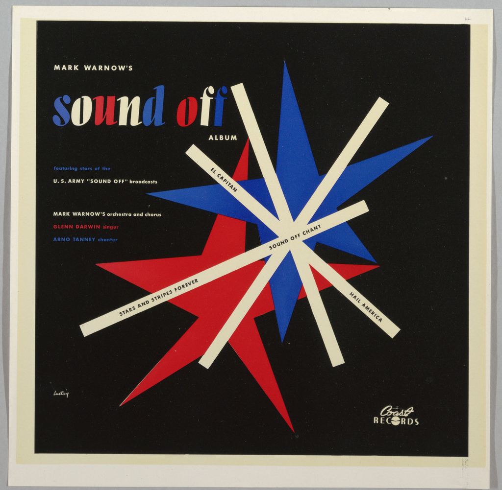
Alvin Lustig was one of the most influential graphic designers of mid-20th century America, despite the unfortunate brevity of his career. Well-known for his designs of books, book jackets, and magazines, Lustig also designed several record jackets for albums of classical and concert band music. Four such albums bearing Lustig’s design are featured in Cooper Hewitt’s...