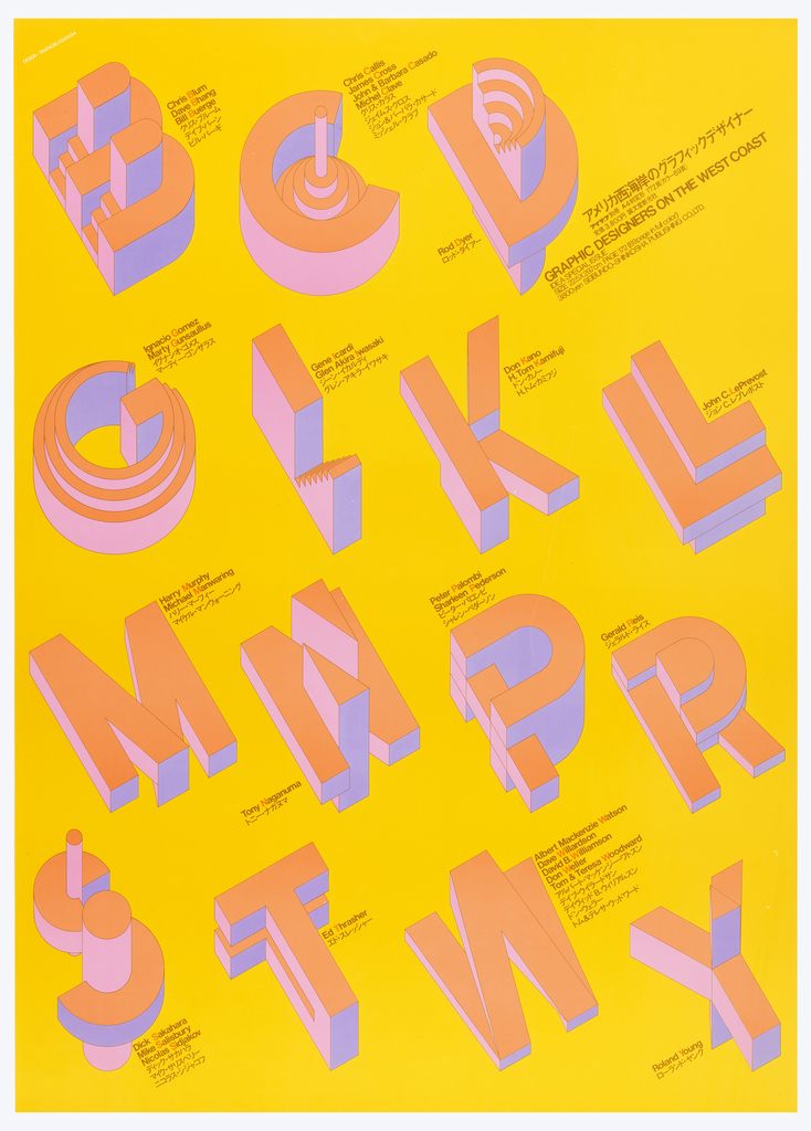
In 1975, Takenobu Igarashi created the poster “Graphic Designers on the West Coast” to promote a publication that introduced American graphic designers from the West Coast to Japanese audiences. Igarashi’s simple composition is enhanced by the sculptural, three dimensional quality of letterforms that playfully refer the initials of the designers’ names featured in the book. Bright colors evoke the warm climate and sunny optimism of the West Coast, a color scheme that most certainly would have stimulated viewers’ curiosity about the American design scene.
After all, 1975 was the year when Igarashi started exploring perspective lettering, which later became his signature design technique. He first employed letters in perspective for the cover of Idea magazine No. 130. Compared to those on his West Coast poster, produced in the same year, the letters on the magazine cover are far less complex and more solid in form. Robert K. Brown, the owner of the Reinhold Brown Gallery, points out that Igarashi’s treatment of letters on the magazine cover bears a striking resemblance to a cover design for Broom magazine, designed by the Russian avant-garde designer and artist El Lissitzky in 1922.[1]
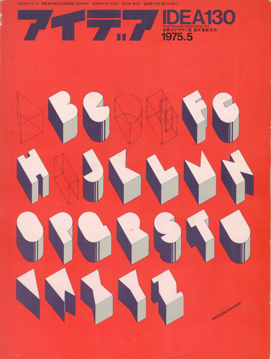
Cover design for Issue No.130 of Idea magazine.
According to Brown, Igarashi’s strong interest in letterforms as ornamental elements is linked to the experimental uses of letters found in artworks and designs from the European avant-garde movement of the 1920s.[2] Many Cubist painters, Futurists, and Dadaists used letters as expressive elements in their works, while graphic designers were interested in the pragmatic application of letters as communication tools.[3]
Yet, it is crucial to note that Igarashi wasn’t just adhering to the previously established visual language of modern art and design. The West Coast poster in fact shows Igarashi’s expansion of vision as he adds more complex structures to the simple letterforms, thereby increasing their ornamentality. His evolution of letters didn’t stop with Idea magazine or the West Coast poster, either. A series of calendars, commissioned by MoMA, shows how far Igarashi pushed his interest in reinventing letterforms as his career went on.[4] In many ways, the word letterform or typography no longer suffices to describe the complex illustrations seen in his calendar work. The contrast between this work and earlier incarnations of his letterforms is remarkable.
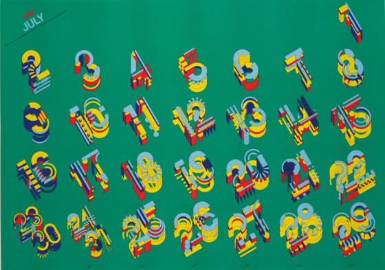
Calendar designed by Takenobu Igarashi for MoMA, July 1989.
The numerals designed for the page of July 1989, for instance look almost like architectural plans for lavish buildings or for an amusement park. The intricate, yet accurately depicted details excite the viewer’s imagination and allow the numbers to be seen from many different perspectives. One might be able to imagine oneself standing inside those architectural structures of the letters in the calendar.
The 3D logo for Parco department store (Part 3) in Tokyo, 1981.
It is not surprising then that Igarashi developed his interest in exploring letters in three-dimensional form in the 1980s, consequently shifting his creative career and becoming a sculptor. As his later work shows, Igarashi’s West Coast poster was undoubtedly a creative breakthrough for the designer. The structures of the sculptural letters on the poster, suggesting four-dimensional space, became a foundation for his later works. The evolutionary process of the Igarashi letters took a great leap over the limits of established norms for typography.
Sakura Nomiyama is a student in the M.A program in the History of Design and Curatorial Studies program offered jointly offered by the Parsons School of Design and the Cooper Hewitt, Smithsonian Design Museum. She is a curatorial intern in the Drawings, Prints & Graphic Design Department of the Museum.
[1] Igarashi, Takenobu, Robert K. Brown, Y. Shirakura, and Yuriko Kuchiki. Igarashi Alphabets: From Graphics to Sculptures. Zurich: ABC Edition, 1987.8.
The image of the Broom magazine is available to view at http://www.museothyssen.org/microsites/exposiciones/2006/Vanguardias/fundacion/fundacion53_ing.html
[2] Ibid., 5.
[3] Ibid.
[4] Igarashi worked on this project between 1984 – 1991 and designed 4356 variations of three-dimensional numerals based on 84 different ideas.
Takenobu Igarashi, “MoMA poster calender,” accessed January 25th 2016, http://www.takenobuigarashi.jp/en/artwork/39/,