
The Japanese graphic designer Ikko Tanaka is recognized as a pioneer of modern Japanese graphic design. He merged western modernist aesthetics and Japanese tradition to generate a new visual expression for contemporary audiences. Tanaka’s frequent use of geometric forms and a limited color palette is clear evidence of his strong respect for the Bauhaus, the influential German design school that operated between 1919 and 1933. Yet unlike the mechanical aesthetics often found in modernist design, Tanaka’s approach always had a sense of playfulness.
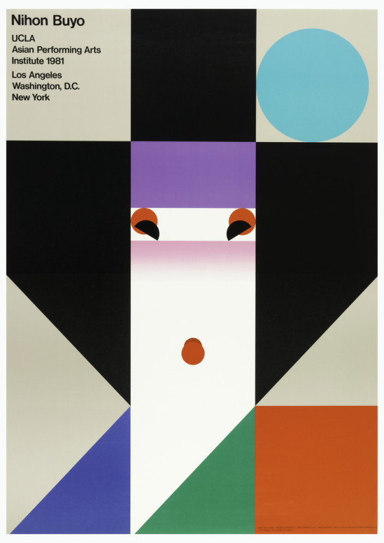
Poster, Nihon Buyo, 1981. screenprint on paper. Gift of Ikko Tanaka. 1993-55-6.
In his iconic Nihon Buyo poster, created for a traditional Japanese dance performance at the Asian Performing Arts Institute of UCLA (University of California at Los Angeles), Tanaka illustrated a simplified geisha by laying out limited colors and forms on a grid structure. Despite his elimination of figurative visual depiction, Tanaka successfully captured the characteristics of the typical geisha look: the unique hair arrangement and the use of bright red makeup. With her pink cheeks, the lady in the poster looks lively and charming. She carries a cheerful personality that adds a welcoming mood to the poster.
In a poster produced for JAPAN PRINT ’91[1], an exhibition of Japanese graphic design in Madrid, Spain in 1991, Tanaka challenged himself to pursue even more simplicity. The poster, entitled Communication & Print, carries a clear resemblance to the Nihon Buyo poster in terms of its subject matter–a human figure‑‑and its use of a limited color palette. However, in this poster, Tanaka abandoned the grid system and instead created a human figure through the unique interplay of color. Here, three dots form the eyes and mouth while the colorful forms at the bottom pay homage to the Nihon Buyo color scheme.
Interestingly, Tanaka often created posters outside of the commercial world for the sake of his creativity, and defined them as graphic art.[2] In this practice, he never hesitated to borrow ideas from his earlier graphic art and commercial work in order to explore further possibilities of visual expression. The comparison between the Nihon Buyo poster and the Communication & Print poster shows the creative interplay between two seemingly discrete disciplines: art and design. The Communication & Print poster exemplifies how Tanaka advanced simplicity from his old work. In this poster, simplicity is not about the reduction of visual elements but about maximizing a visual message with minimum components. Now we look at the figure in the poster again. The figure looks at us, and ask us this question in amazement: “Do I look simple?”
Sakura Nomiyama is a student in the M.A program in the History of Design and Curatorial Studies program offered jointly offered by the Parsons School of Design and the Cooper Hewitt, Smithsonian Design Museum. She is a curatorial intern in the Drawings, Prints & Graphic Design Department of the Museum.
[1] Along with other internationally acclaimed designers including Yusaku Kamekura and Shin Matsunaga, Tanaka was commissioned to create a poster in response to the given theme “Communication & Print.” Thus, this poster was not made for a promotional purpose, the conventional function of a poster, but was created to be exhibited as a work of art.
“Communication&Print 「新作ポスター10人展」,” Ginza Graphic Gallery. Available: http://www.dnp.co.jp/CGI/gallery/exhibition/detail.cgi
[2] Tanaka held several exhibitions of his graphic art works throughout his career as a graphic designer. Ikkō Tanaka and Hiroshi Kashiwagi. Tanaka Ikkō kaiko ten: warera dezain no jidai = Ikko Tanaka : A retrospective.( Tōkyō: Asahi Shinbunsha, 2003), 266.