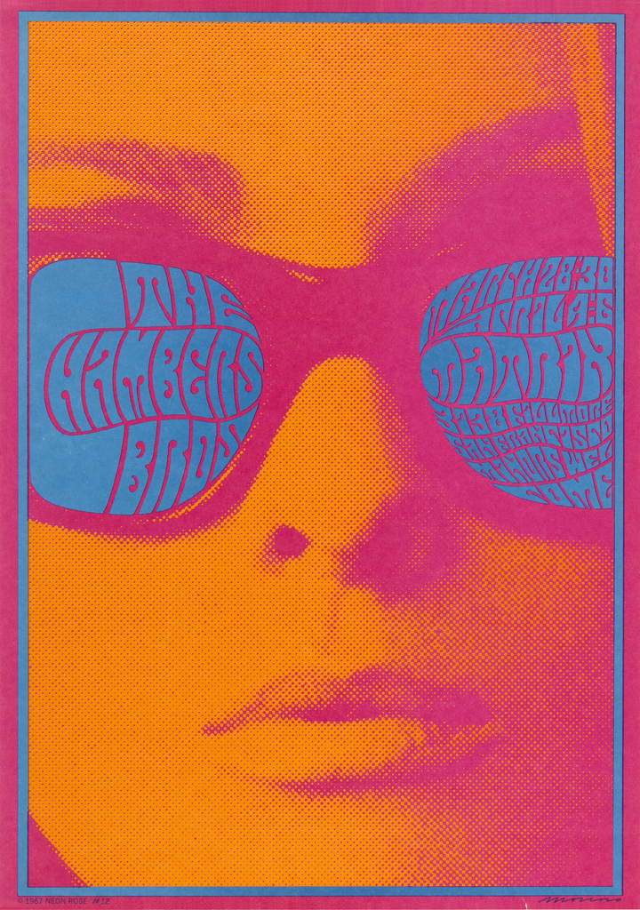
Stare into the electric blue shades of this woman’s sunglasses and what do you see? Even if you know what you are looking for, the blue letterforms come together to form coherent words only with sustained visual focus. If you were to advertise a concert that you wanted people to come to, would you make it this difficult for your audience to find out about it? Or could it be that the designer had something else in mind?
Before Victor Moscoso began producing psychedelic posters, he understood that the basic rule of successful poster design was to “transmit a message simply and quickly.” Unlike many of his compatriots, including Wes Wilson, Stanley Mouse and Rick Griffin, Moscoso came to graphic design with a great deal of training. Born in Galicia, Spain in 1936, Moscoso moved to Brooklyn, New York as a young child, and worked briefly in the commercial advertising industry as a teenager before enrolling at the Cooper Union Art School in 1954. It was there that Moscoso first became aware of the color theory of former Bauhaus master Josef Albers. Moscoso subsequently attended Yale University from 1957 to 1959, where he studied with both Albers as well as the famed Swiss-born designer Herbert Matter. Moscoso absorbed the lessons that Albers taught, but it was not until the mid-1960s that he realized he could exploit his understanding of color theory to create a transformative approach to poster design, one that demanded the viewer’s close and prolonged attention.
Even after leaving Yale, Moscoso had not finished with his formal artistic training. He moved to the West Coast and enrolled at the San Francisco Art Institute, where he learned the process of stone lithography. In California, Moscoso realized the critical role of poster art in the counter-culture movement. He chose to produce posters that would advertise an event, typically a concert, but that lived extended lives as souvenirs and art pieces in their own right long after the event had ended. Moscoso also inverted that basic tenet of poster design—to keep everything simple and legible—through his embrace of “vibrating colors.” Albers had taught that by placing two or more bright, deeply saturated colors beside each other, a visual vibration could be created, making it more difficult to “read” the poster. To make the viewing experience even more demanding and complex, Moscoso adopted a style of psychedelic lettering, derived from Wes Wilson, that gave the appearance of the individual letters melting away.
Chambers Brothers Band (Neon Rose #12) was produced by Moscoso in 1967 for his own poster company, Neon Rose. To create the image, Moscoso took a photograph of a model wearing sunglasses that he found in a fashion magazine, hand-sketched the intricate lettering inside the frames of the glasses, and then selected a color palette of pink, orange and blue that would produce the vibrating effect. The poster has since become an icon of the psychedelic movement and graphic design. It was one of roughly eighty posters that Moscoso designed in the 1960s.
Neon Rose #12 was designed to advertise a band whose music evokes the spirit of the moment in which it was made. The Chambers Brothers band continues to be known for their evocative blending of soul, gospel, funk, blues and psychedelic rock. Check out this 1970 video of a performance of their biggest hit, Time Has Come Today, for some serious psychedelic clock action! Other recordings by The Chambers Brothers can be heard at Smithsonian Folkways.