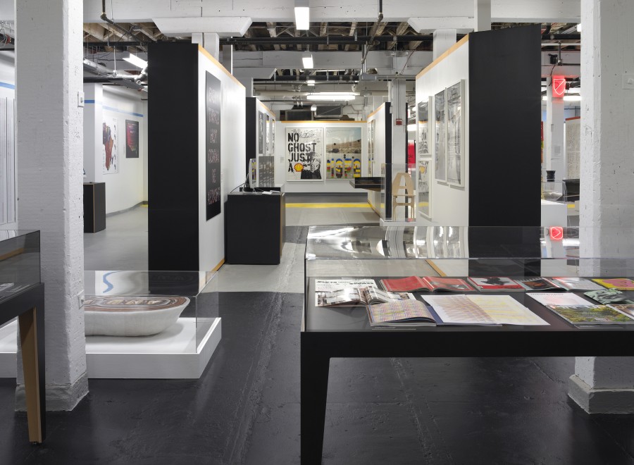
One focus of Cooper-Hewitt’s current exhibition, Graphic Design—Now in Production, is the field of motion graphics. The exhibition features the opening credits of television series, like Six Feet Under and Dexter. Cooper-Hewitt asked Twitter followers which TV shows and movies they thought feature great title sequence design. A big thank you to followers @Epavisha, @Kmhaag, @Kelseykrz, @Cmoa, and @Yarngeek for their keen eyes for graphics on screen. And, next time you go to the movies, give credit to the credits!
Epavisha: @cooperhewitt I can't get the "I Am Love" opening credits out of my head! Beautiful typography, music & visual combo. #GraphicDesignNow
Kmhaag: @cooperhewitt, Michael Cendron's title sequence for I Am Love
In the opening credits to the movie I Am Love (2009), shots of snowy, isolated, and somewhat eerie views of Milan, Italy are complemented with credit lines in elegant white script. Delicate, yet urgent, classical music plays as the scenery changes, and the combination of graphic design and typography gives this opening display an anachronistic vibe (despite the film’s modern 2009 release date.) These opening credits are nothing short of memorable, and they serve as a perfect example of the way in which graphic design is crucial to achieving a cinematic vision in the credit sequence of many movies.
Kelseykrz: @cooperhewitt The opening credits for Se7en and Catch Me If You Can #GraphicDesignNow
For those of you who have seen the movie Se7en (1995), you know that the opening credits alone can send shivers down your spine. Set to a dark, industrialized remix of the song Closer by Nine Inch Nails, brief, flashing frames show an unidentified pair of hands completing numerous disturbing tasks. Shadowy, sepia-toned lighting and a crackly film texture add to the dark aura of the scene as the person looks at gory images, clips photographs, and writes in a notebook. The true genius of this opening sequence, however, lies in the type design. Between one second segments of images, the screen dims to display a flickering white text in a haunting font against a dark backdrop. The typography completes the disturbing and eerie vibe captured by the director.
The opening credits to Steven Spielberg’s Catch Me if You Can (2002) may feature one of the finest examples of graphic design in cinema. Entirely animated and set to 1960s jazz music, this opening sequence features one animated male shadow chasing another through a series of frames with a variety of geometric shapes, patterns, and colors. The graphic typography of the credit lines is cleverly incorporated into the aesthetic quality of each mini-scene, so that the text itself serves as part of the visual does not simply overlay the animated scene underneath. If not for the abundant creativity in graphic design, films would not be able to so urgently capture the audience's attention, as this one does.
Cmoa: @cooperhewitt Credits worth crediting? Blow-Up.#GraphicDesignNow
The opening credit sequence for the movie Blow-Up (1966) is unique and memorable, particularly for its time period. Set to 1960s rock and roll instrumentals, transparent text flashes across a green-colored screen to display brief snippets of moving scenes that play behind the text, only permitting the viewer to decipher a small fragment of movement in the underlying scenes through the shapes of the letters. Even in the mid 1960s, graphic designers were creatively incorporating graphic text and typography into cinematic art in order to transform what might otherwise be a dull portion of a film—the credits—into a vital element of the story.
Yarngeek: @cooperhewitt Monsters, Inc.
The opening credits to Monsters, Inc. (2001) are similar in many ways to those of Catch Me if You Can (2002). Every piece of text is cleverly and playfully assigned a role in the short animated sequence. Letters bounce and scramble themselves across the screen to form words, monsters swallow letters from the screen, and doors open and close to reveal different text. Graphic designers in charge of opening credit sequences such as this one do far more than choose a font; it is their job to create a way to display a legible message for an audience while still making sure it remains a cohesive part of the visual display of the scene and the story. Credits such as these are perfect for children’s movies, as they are able to hold an audience’s attention prior to the film’s opening plot scene.